Home » Fonts » 25 All-Time Best Fonts in Microsoft Word

25 All-Time Best Fonts in Microsoft Word
- January 11, 2024
- Written by a professional
Summary: While exploring the vast Microsoft Word's font library, I've handpicked 25 fonts that are my all-time favorite. My top three choices include:
- Impact : A bold choice, perfect for making strong, eye-catching headlines and statements.
- Goudy Old Style : Offers an elegant, traditional feel, ideal for formal documents.
- Century Gothic : Clean and modern, it's great for contemporary designs.
Diving into the diverse world of Microsoft Word's fonts, this selection of 25 is tailored for various needs and aesthetics. From enhancing business documents to giving a stylish edge to creative projects, these fonts cover a broad range of uses. Eager to discover these font gems? Join me in exploring their distinctive styles and practical applications, and see how they can transform your Word documents!
TOP 25: best fonts in Microsoft Word
- Goudy Old Style
- Century Gothic
- Baskerville Old Face
- The Serif Hand
- Cooper Black
- Gill Sans Nova
- Alasassy Caps
- Avenir Next LT Pro
- Century Schoolbook
- Georgia Pro
- Verdana Pro
- Vivaldi Italic
- Chamberi Super Display Regular
- Mystical Woods Smooth Script
- Tisa Offc Serif Pro
- Britannic Bold
- Baguet Script Regular
- Modern No. 20
- Modern Love Caps
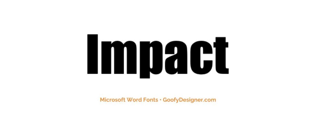
- About Impact: Ideal for headlines and short titles, Impact is perfect for designs needing a bold, assertive font that captures attention instantly.
2. Goudy Old Style
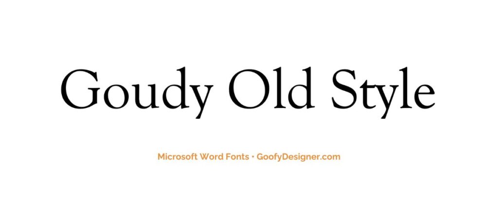
- About Goudy Old Style: Best suited for formal documents, like legal and academic papers, where a traditional and professional typeface is required.
3. Century Gothic
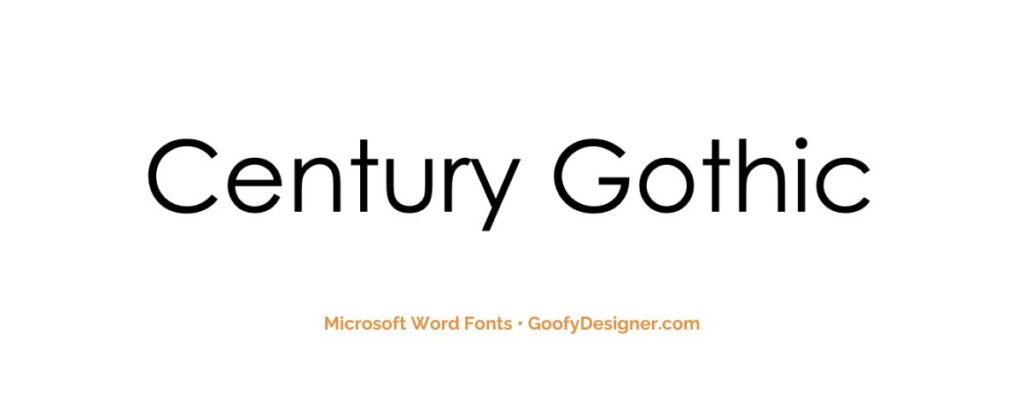
- About Century Gothic: A clean and modern sans-serif font, great for business and academic documents that require a sleek, contemporary look.
4. Baskerville Old Face
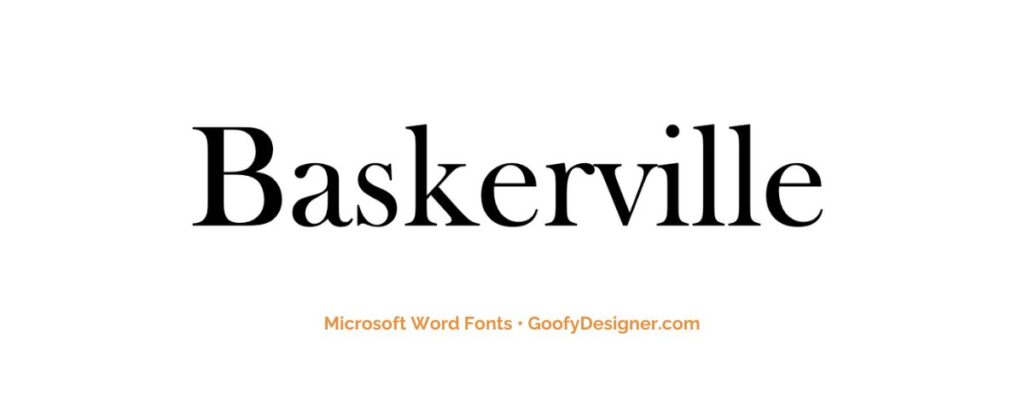
- About Baskerville Old Face: Perfect for literary and academic publications, this font offers a classic, elegant feel that enhances the readability of extensive texts.
5. The Serif Hand
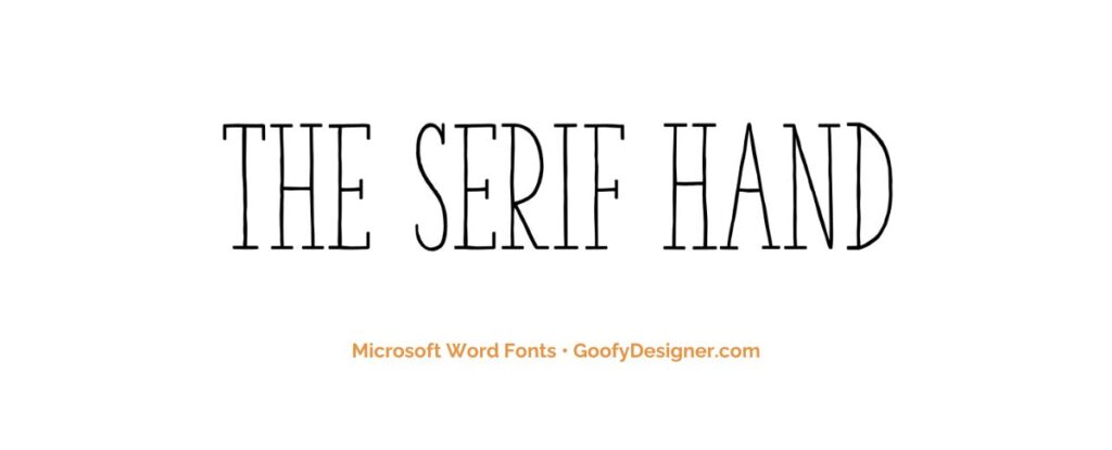
- About The Serif Hand: Ideal for casual, personal documents or creative projects that benefit from a relaxed, handwritten appearance.
6. Cooper Black
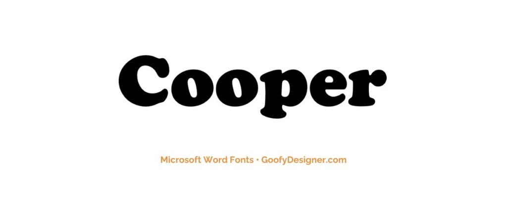
- About Cooper Black: A great choice for playful and bold designs, like posters and book covers, where a friendly and eye-catching font is needed.
7. Gill Sans Nova
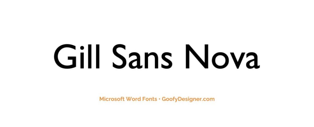
- About Gill Sans Nova: Suitable for both corporate and creative documents, this versatile font offers a modern, clean look for various applications.
8. Alasassy Caps
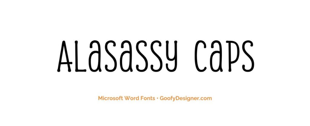
- About Alasassy Caps: Perfect for artistic or elegant designs, such as wedding invitations or stylish branding materials, where a decorative touch is desired.
9. Avenir Next LT Pro
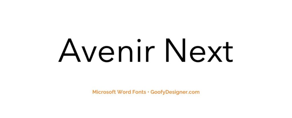
- About Avenir Next LT Pro: A modern and versatile font, great for corporate branding, digital content, and user interfaces requiring a clean, approachable look.
10. Century Schoolbook
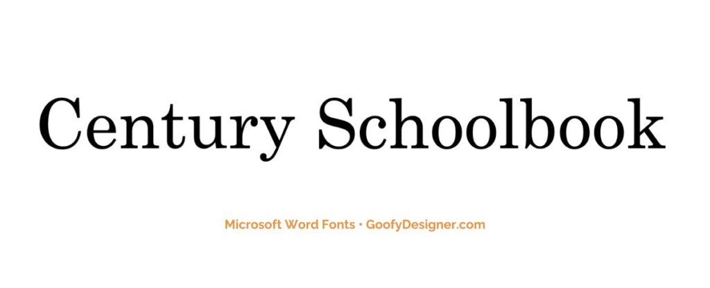
- About Century Schoolbook: Often used in educational materials and children's books, this font is designed for high readability and a comfortable reading experience.
11. Georgia Pro
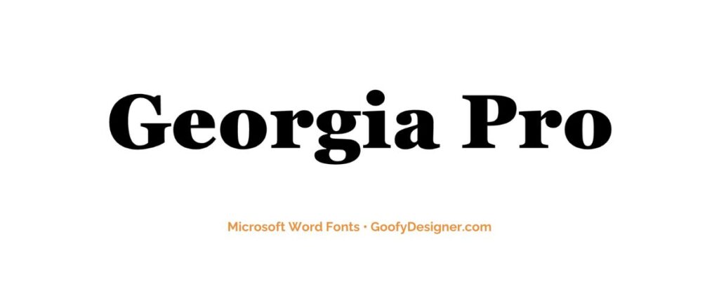
- About Georgia Pro: An excellent choice for both print and digital media, this font is renowned for its readability and classic elegance.
12. Verdana Pro
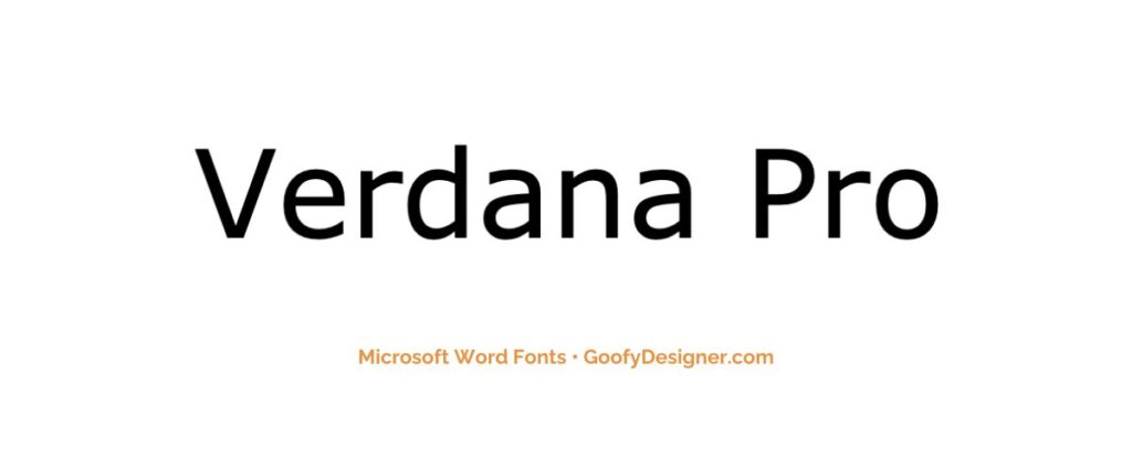
- About Verdana Pro: Ideal for web content and screen reading, offering exceptional clarity and legibility even at small sizes.
13. Vivaldi Italic
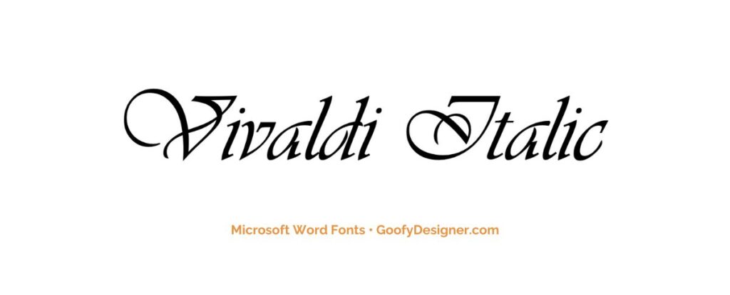
- About Vivaldi Italic: Best for formal invitations and certificates, this font adds a touch of elegance and sophistication with its ornate, script style.
14. Chamberi Super Display Regular
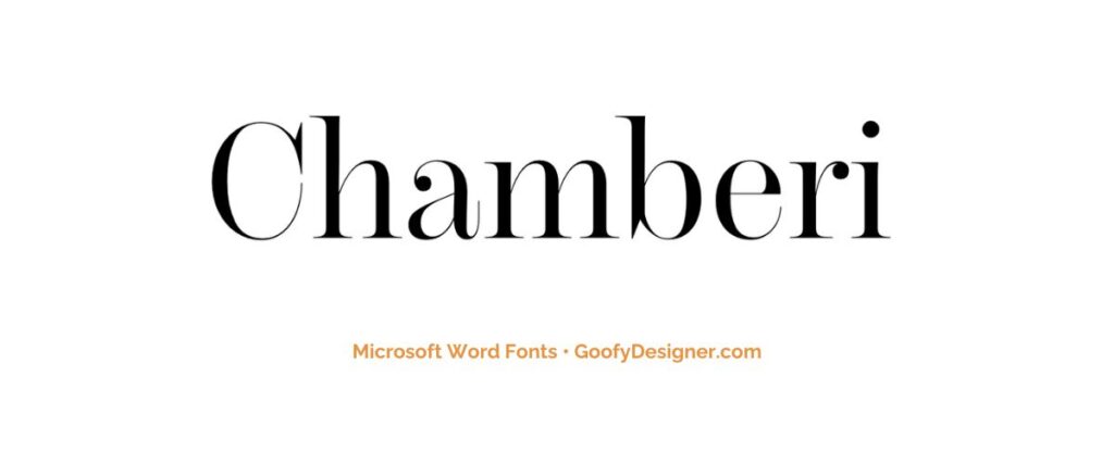
- About Chamberi Super Display Regular: A bold, modern font, perfect for impactful headlines, advertising, and any design needing a elegant and sophisticated feel.
15. Garamond
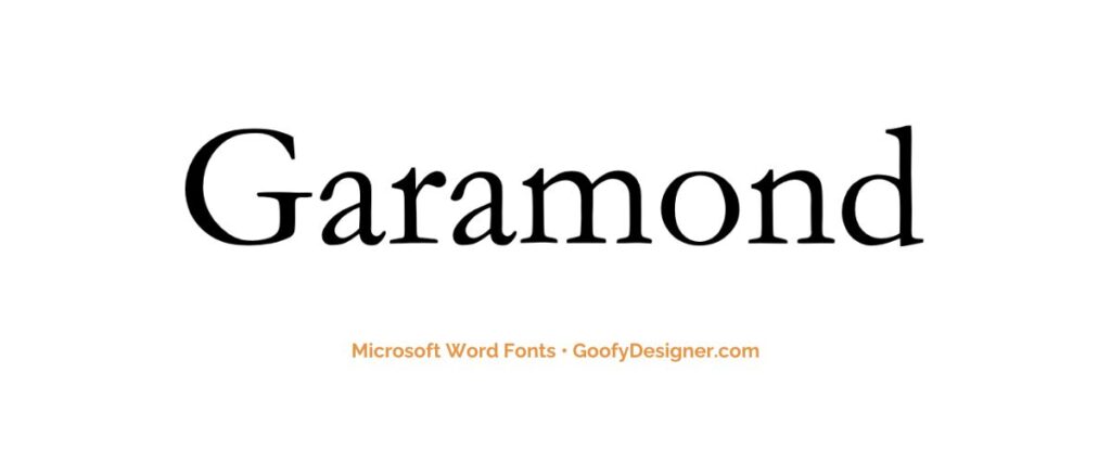
- About Garamond: This timeless font is suited for formal documents and publishing, offering a professional and classic appearance.
16. Broadway
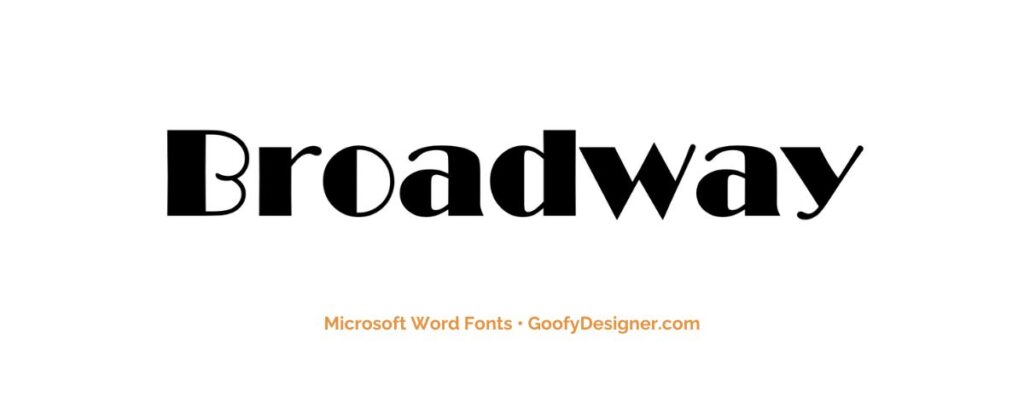
- About Broadway: Great for theatrical posters, event announcements, and designs requiring a retro, 1920s flair.
17. Tw Cen MT
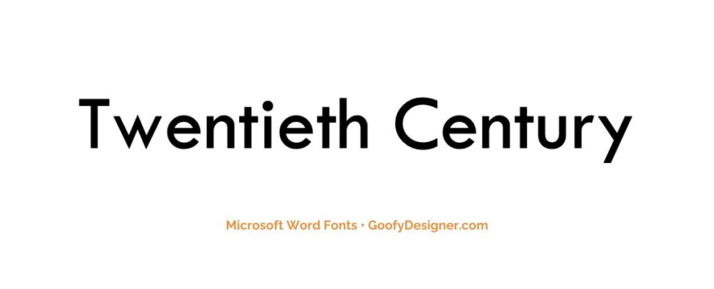
- About Tw Cen MT: A versatile font that works well for both headings and body text, suitable for a variety of professional and creative applications.
18. Gungsuh
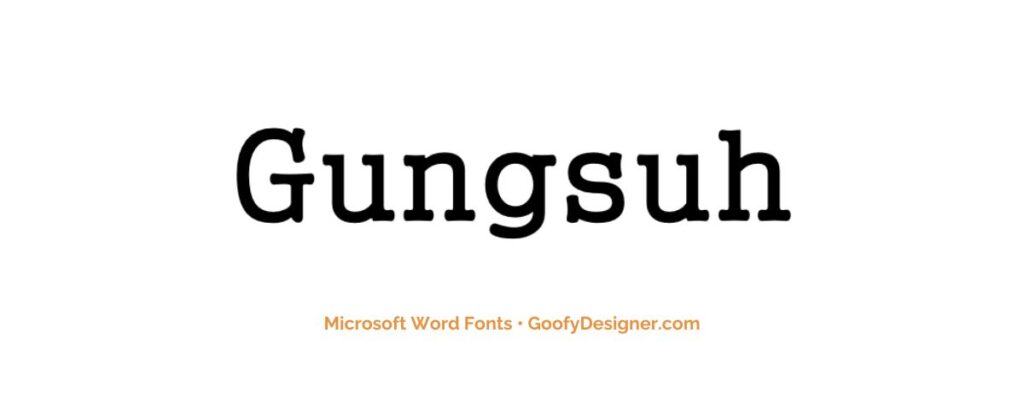
- About Gungsuh: This font is ideal for documents requiring an Asian aesthetic, offering a unique, stylized appearance for multilingual projects.
19. Mystical Woods Smooth Script
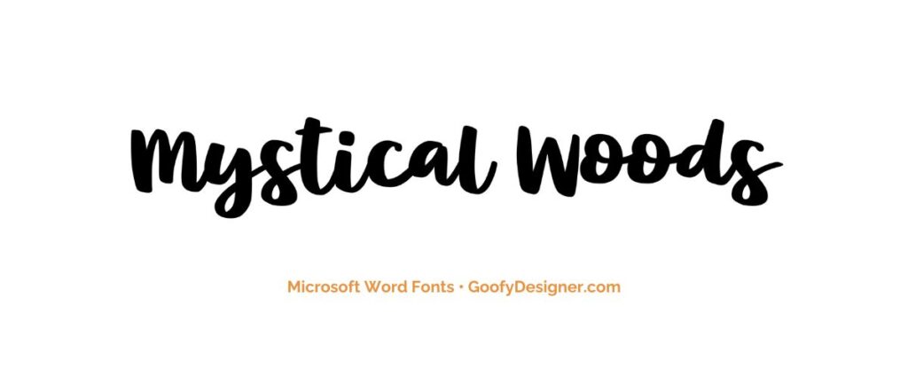
- About Mystical Woods Smooth Script: Perfect for fantasy-themed designs and creative projects that require a whimsical, handcrafted script style.
20. Tisa Offc Serif Pro
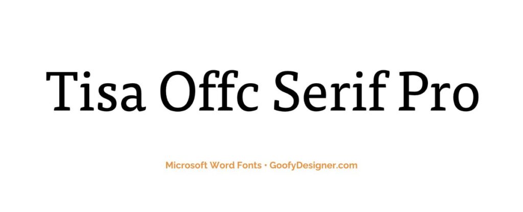
- About Tisa Offc Serif Pro: A contemporary serif font, excellent for editorial content, offering great readability and a modern yet professional look.
21. Britannic Bold
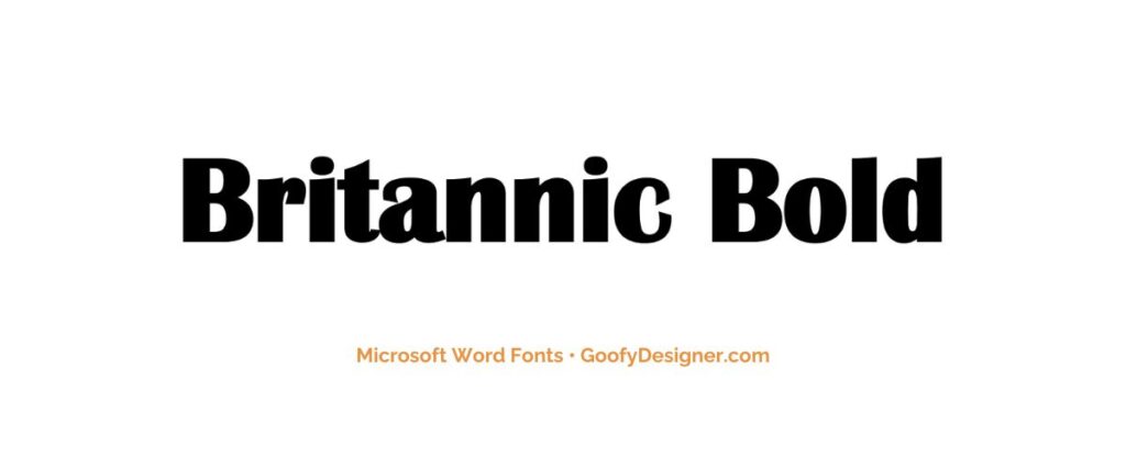
- About Britannic Bold: This font is a strong and assertive font, perfect for headlines and branding that require a modern, yet slightly playful and approachable character.
22. Rockwell
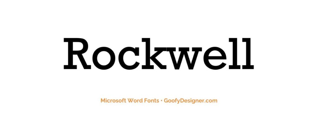
- About Rockwell: A strong, slab-serif font, ideal for headlines and statements in both print and digital media that require a solid, authoritative presence.
23. Baguet Script Regular
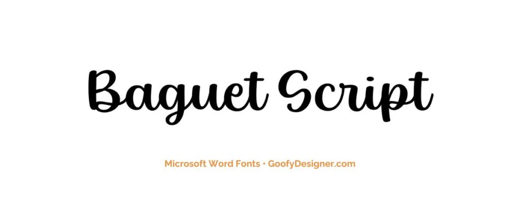
- About Baguet Script Regular: This elegant script font is perfect for wedding invitations, formal events, and branding where a touch of sophistication is desired.
24. Modern No. 20
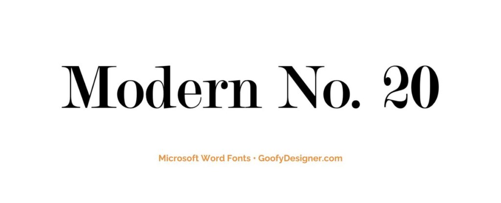
- About Modern No. 20: Ideal for formal documents, such as certificates and awards, offering a traditional, refined style.
25. Modern Love Caps
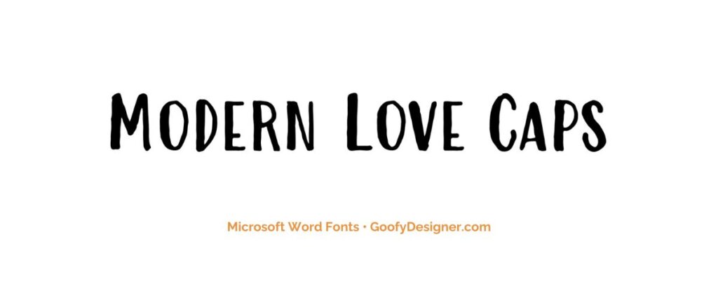
- About Modern Love Caps: Great for fashion and lifestyle branding, where a stylish, contemporary font can add a chic, modern touch.
Want more amazing fonts?
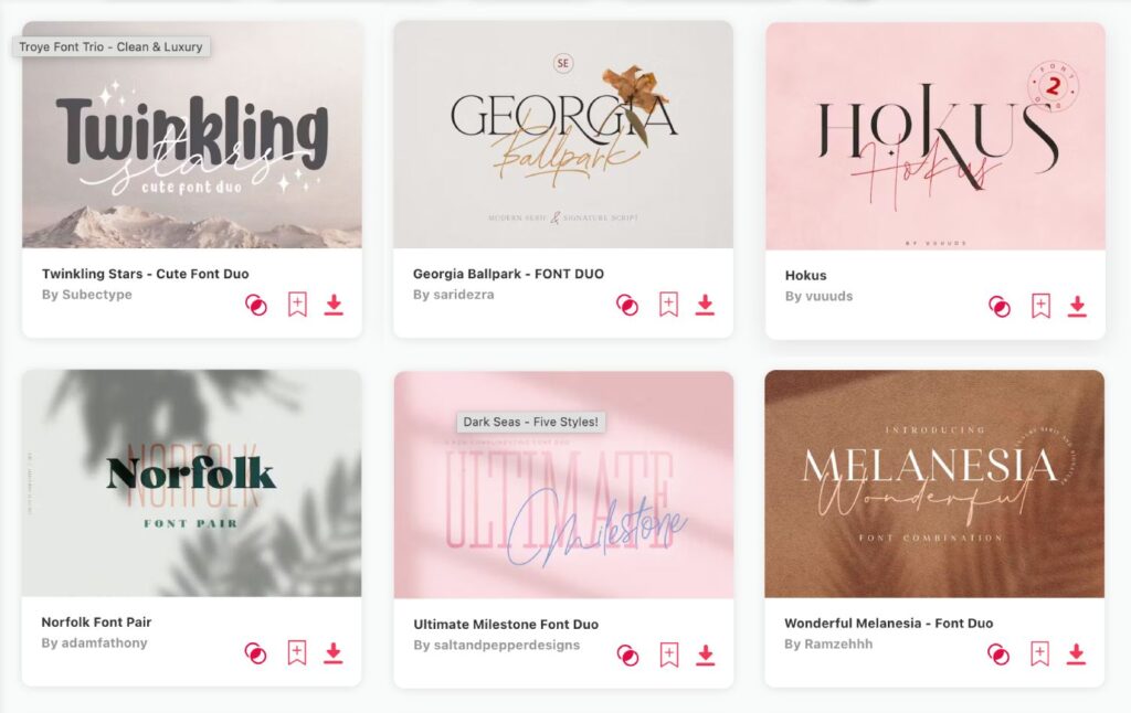
If you want to find more fonts and get access to milions of elements for Canva, browse my favorite site: Envato Elements .
They have all kinds of assets such as:
- Fonts (40,000+)
- Stock photos (9,3M+)
- Graphic templates (270,000+)
- Presentation templates (110,000+)
- Stock videos (5,1M+)
- Video templates (96,000+)
- 3D elements (210,000+)
- WordPress assets (6,500+)
- Royalty-free music (140,000+)
How to choose the best font in Microsoft Word?
- Consider the Purpose: Different documents require different fonts; a formal report may need a more professional font, while a creative flyer might benefit from a more decorative one.
- Readability: Choose fonts that are easy to read, especially for long texts. Sans-serif fonts are often more readable, particularly on digital screens.
- Audience and Context: Consider who will be reading the document and in what context. A young audience or a casual event might allow for more playful fonts.
- Pairing Fonts: If using more than one font, ensure they complement each other. A common approach is pairing a serif font for headings with a sans-serif for body text.
- Branding and Consistency: For business or personal branding, select fonts that align with the brand's style and use them consistently across all documents.
What are Microsoft Word fonts usually used for?
- Professional and Formal Documents: Certain fonts are favored for their clean and clear appearance, making them suitable for official reports, business correspondence, and academic writing.
- Creative and Decorative Purposes: Some fonts offer a more decorative or unique style, which is ideal for designing invitations, posters, and marketing materials that require a creative touch.
- Digital and Screen Readability: There are fonts specifically designed for digital readability, ensuring clarity and ease of reading on computer screens, tablets, and smartphones.
- Educational Content: For educational materials, especially those aimed at young learners, fonts that are simple, clear, and easy to read are often chosen to facilitate better comprehension and learning.
- Branding and Marketing Consistency: In branding and marketing, selecting a consistent font style across all materials is crucial as it helps in maintaining brand identity and recognition in all forms of communication and documentation.
Concluding our exploration of the 25 best fonts in Microsoft Word, the top picks that stand out for me are Impact , Goudy Old Style , and Century Gothic . However, it's important to remember that the term ‘best' is subjective and greatly depends on the specific needs and tone of your project. The ideal font choice will vary based on what you're creating and the ambiance you wish to convey. Approach this journey with excitement and allow your creative instincts to guide you. Each font has its own unique charm and character, ready to enhance and uplift your specific design aesthetic. Embrace this typographic adventure with enthusiasm and discover the perfect font to express your vision!
Hana Terber
Latest articles on goofy designer.

10 Best After Effects Award Show Templates (My Favorites)
Summary: In this guide, I’ve picked out 10 amazing After Effects templates for award shows that I think will really make your video projects shine.
10 Best After Effects Hud UI Packs (My Favorites)
Summary: In this guide, I’ve meticulously curated a selection of 10 outstanding After Effects HUD UI template packs that I believe will perfectly complement your

10 Best After Effects Action Vfx templates (My Favorites)
Summary: In this guide, I’ve chosen a selection of 10 outstanding After Effects action VFX (visual effects) templates that I believe will perfectly complement your
10 Best After Effects Company Profile Video Templates (My Favorites)
Summary: In this guide, I’ve carefully selected a collection of 10 excellent After Effects company profile video templates that I think are perfect for improving

Stay notified

👀 Turn any prompt into captivating visuals in seconds with our AI-powered design generator ✨ Try Piktochart AI!
14 Fonts That Make Your PowerPoint Presentations Stand Out
Presentation fonts, more generally known as typography , are one of the most neglected areas of presentation design .
That’s because when presentation fonts are used appropriately and correctly, they blend so well with the overall design that your audience doesn’t even notice it. Yet, when your font usage is lacking, this sticks out like a sore thumb.
Over 30 million PowerPoint presentations are made daily. Therefore, when it comes to creating your own slide decks, you need to take every advantage you can get to make it stand out. Among other design choices, choosing the best fonts for presentations can provide a huge impact with minimal effort.
In fact, it’s one of the reasons why Steve Jobs was able to turn Apple into the brand it is today. His expertise in branding and design was fueled by the Calligraphy classes that he attended in his early years. This allowed him to find the best font family that accentuated his company’s brand and identity.
So no matter the subject of your PowerPoint presentation, the best font or font family will help you create a lasting impression and convey a powerful message. To help you shine through your next slideshow, here’s our cultivated list of the best fonts for presentations.
If you want to create a PowerPoint presentation but don’t have access to PowerPoint itself, you can use Piktochart’s presentation maker to create a presentation or slide deck and export it as a .ppt file.
Best Fonts for Presentations and PowerPoint
Before we proceed, you should know some basics of typography, especially the difference between Serif, Sans Serif, Script, and Decorative types of fonts.
Serif Fonts
These are classic fonts recognizable by an additional foot (or tail) where each letter ends. Well-known Serif fonts include:
- Times New Roman
- Century
Sans Serif Fonts
Differing from the Serif font style, Sans Serif fonts do not have a tail. The most popular Sans Serif font used in presentations is Arial, but other commonly employed renditions of Sans Serif typeface include:
- Century Gothic
- Lucida Sans
Script and Decorative Fonts
These are the fonts that emulate handwriting—not typed with a keyboard or typewriter. Script typefaces and decorative or custom fonts for PowerPoint vary immensely and can be created by a graphic designer to ensure these custom fonts are bespoke to your company/brand.
With these font fundamentals explained, you can also keep up-to-date with the popularity of such fonts using Google’s free font analytics tool here . Let’s now go ahead with our list of the best presentation fonts for your PowerPoint slides.
- Libre-Baskerville
Keep in mind that you don’t have to stick with only a single font for your slides. You could choose two of the best fonts for your presentation, one for your headings and another for the copy in the body of the slides.
Without further ado, let’s dive into the 14 best presentation fonts.
1. Helvetica

Helvetica is a basic Sans Serif font with a loyal user base. Originally created in 1957 , Helvetica comes from the Latin word for ‘Switzerland’ where it was born. When you use Helvetica, the top-half part of the text is bigger than in other Sans Serif fonts. For this reason, letters and numbers have a balanced proportionality between the top and bottom segments. As a result, this standard font makes it easier to identify characters from a distance.
As a result of being one of the easiest typecases to read compared to different presentation fonts, Helvetica is great for communicating major points as titles and subheadings in a Microsoft PowerPoint presentation.
For these reasons, Helvetica is a popular choice for anyone creating posters .
If you are presenting live to a large group of people, Helvetica is your new go-to font! The classic Sans Serif font is tried and tested and ensures the legibility of your slide deck, even for the audience members sitting at the very back. Though it looks good in any form, you can make Helvetica shine even more in a bold font style or all caps.
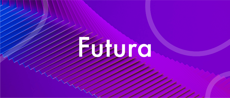
Futura is one of the popular Sans Serif fonts and is based on geometric shapes. Its features are based on uncomplicated shapes like circles, triangles, and rectangles. In other words , it mimics clean and precise proportions instead of replicating organic script or handwriting. Futura is a great default font for presentations because of its excellent readability, elegance, and lively personality.
As one of many standard fonts designed to invoke a sense of efficiency and progress, Futura is best employed when you want to project a modern look and feel in your presentation. Futura is a versatile option ideal for use in both titles and body content, accounting for why it has remained immensely popular since 1927.
3. Rockwell
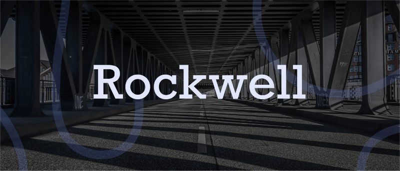
The Rockwell font has strong yet warm characters that make it suitable for a variety of presentation types, regardless of whether it’s used in headings or the body text. However, best practice dictates that this standard font should be used in headers and subheadings based on its geometric style. Rockwell is a Geometric Slab Serif , otherwise known as a slab serif font alternative. It is formed almost completely of straight lines, flawless circles, and sharp angles. This Roman font features a tall x-height and even stroke width that provides its strong presence with a somewhat blocky feel.
Monoline and geometric, Rockwell is a beautiful font that can display any text in a way that looks impactful and important. Whether you want to set a mood or announce a critical update or event, you can’t go wrong with this robust font.

Verdana is easily a great choice as one of the top PowerPoint presentation fonts. Its tall lowercase letters and wide spaces contribute significantly towards boosting slide readability even when the text case or font size is small. That’s why Verdana is best for references, citations, footnotes, disclaimers, and so on. Additionally, it can also be used as a body font to extrapolate on slide headings to nail down your key points.
Besides that, it is one of the most widely available fonts, compatible with both Mac and Windows systems. This makes this modern Sans Serif font a safe bet for when you are not certain where and how will you be delivering your presentation.
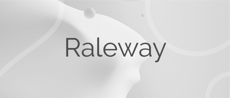
Raleway is a modern and lightweight Sans Serif font. Its italicized version has shoulders and bowls in some letters that are a bit off-centered. What this means is that the markings excluding the stem are intentionally lower or higher as compared to other fonts.
This gives Raleway a slightly artistic look and feels without impacting its readability (and without falling into the custom or decorative fonts category). In fact, many professionals think the swashes and markings actually enhance the font’s readability and legibility. Moreover, Raleway also has a bold version which is heavily used in presentations and slide decks.

Here’s an example of a slide deck created with our AI presentation maker . The original font was Mada, but changing the text to Raleway gave the slide deck a modern feel, while also being easier to read. You can view the entire presentation here .
The bottom line is that Raleway is a versatile typeface that can be used in a variety of presentations, either in the body copy or in titles and subheadings. When the titles are capitalized or formatted as bold, captivating your audience becomes a breeze.
6. Montserrat
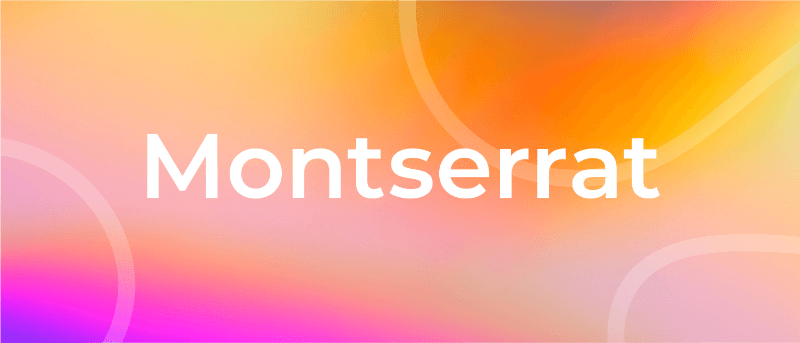
Montserrat is one of our favorite PowerPoint fonts for presentation titles and subheadings. The modern serif font is bold, professional, and visually appealing for when you want your headers and titles to really capture the audience’s attention.
Every time you move to the next slide, the viewers will see the headings and instantly understand its core message.
Another major quality of the Montserrat font is its adaptability and versatility. Even a small change, such as switching up the weight, gives you an entirely different-looking typeface. So you get enough flexibility to be able to use the font in all types of PowerPoint presentations.
Montserrat pairs nicely with a wide range of other fonts. For example, using it with a thin Sans Serif in body paragraphs creates a beautiful contrast in your PowerPoint slides. For this reason, it is usually the first modern Serif font choice of those creating a business plan or marketing presentation in MS PowerPoint.
Create powerful presentations with Piktochart
Piktochart is the easiest way to make powerful presentations. Import your own fonts.
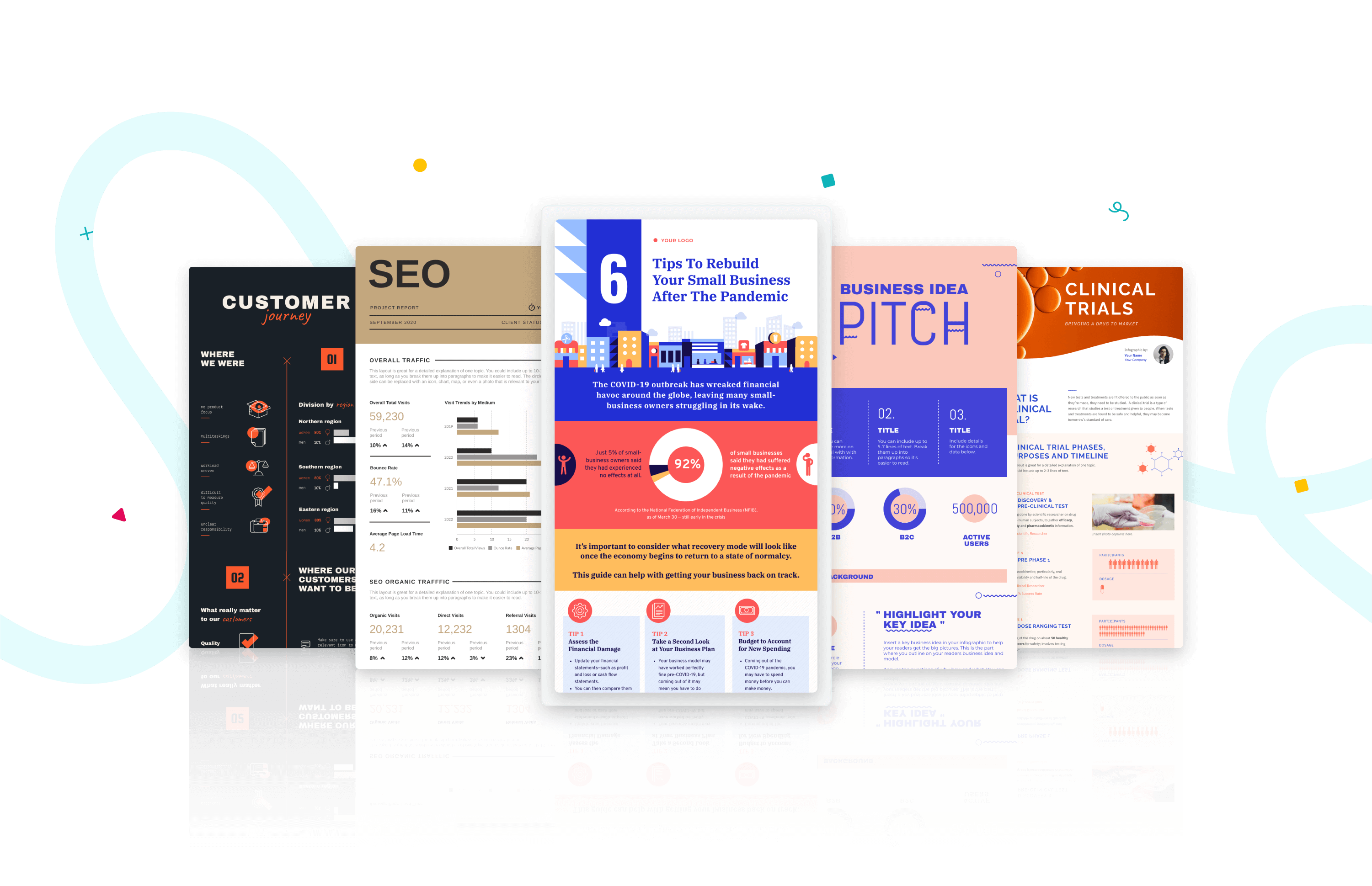
Roboto is a simple sans-serif font that is a good fit for PowerPoint presentations in a wide range of industries. Well-designed and professional, Roboto works especially well when used for body text, making your paragraphs easy to read.
Roboto combines beautifully with several other fonts. When you’re using Roboto for body text, you can have headings and titles that use a script font such as Pacifico, a serif font such as Garamond, or a Sans Serif font such as Gill Sans.
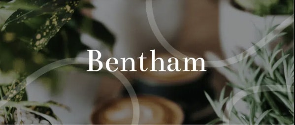
Bentham is a radiant serif font perfectly suited for headings and subtitles in your PowerPoint slides. It gives your presentation a traditional appearance, and its letter spacing makes your content really easy to read.
You can use this font in uppercase, lowercase, or title case, depending on how it blends with the rest of your slide. For best results, we recommend combining Bentham with a Sans Serif font in your body content. For example, you can use a font such as Open Sans or Futura for the rest of your slide content.
9. Libre-Baskerville
Libre-Baskerville is a free serif Google font. You can pair this classic font with several other fonts to make a PowerPoint presentation with a traditional design.
One of its best features is that it works equally well in both headings and body copy. It’s clear and easily readable, no matter how you use it. And when used for headings, it works really well in uppercase form.
Tahoma is one of the fonts that offer the best level of clarity for PowerPoint slides. It has easily distinguishable characters like Verdana, but with the exception of tight spacing to give a more formal appearance.
Designed particularly for screens, Tahoma looks readable on a variety of screen sizes and multiple devices. In fact, this significant aspect is what makes Tahoma stand out from other fonts in the Sans Serif family.
11. Poppins

Poppins falls within the Sans Serif font category but is a different font of its own uniqueness. The solid vertical terminals make it look strong and authoritative. That’s why it’s great for catchy titles and subheadings, as well as for the body paragraphs. Poppins is a geometric typeface issued by Indian Type Foundry in 2014. It was released as open-source and is available in many font sizes for free on Google Fonts.
When you want something that feels casual and professional in equal measure, pick Poppins should be in the running for the best PowerPoint fonts.
12. Gill Sans
Gill Sans is another classic presentation font for when you’re looking to build rapport with your audience. Gill Sans is a friendly and warm Sans Serif font similar to Helvetica. At the same time, it looks strong and professional.
It’s designed to be easy to read even when used in small sizes or viewed from afar. For this reason, it’s a superior match for headers, and one of the best PowerPoint fonts, especially when combined with body text using Times New Roman or Georgia (not to mention several other fonts you can pair it with for successful results). This is the right font for combing different fonts within a presentation.
13. Palatino
Palatino can be classified as one of the oldest fonts inspired by calligraphic works of the 1940s. This old-style serif typeface was designed by Hermann Zapf and originally released in 1948 by the Linotype foundry. It features smooth lines and spacious counters, giving it an air of elegance and class.
Palatino was designed to be used for headlines in print media and advertising that need to be viewable from a distance. This attribute makes Palatino a great font suitable for today’s PowerPoint presentations.
Palatino is also a viable choice for your presentation’s body text. It’s a little different from fonts typically used for body paragraphs. So it can make your presentation content stand out from those using conventional fonts.
14. Georgia

Georgia typeface has a modern design that few fonts can match for its graceful look. It’s similar to Times New Roman but with slightly larger characters. Even in small font size, Georgia exudes a sense of friendliness; a sense of intimacy many would claim has been eroded from Times New Roman through its overuse. This versatile font was designed by Matthew Carter , who has successfully composed such a typeface family which incorporates high legibility with personality and charisma. Its strokes form Serif characters with ample spacing, making it easily readable even in small sizes and low-resolution screens.
Another benefit of using this modern font is its enhanced visibility, even when it’s used in the background of your PowerPoint slides. Moreover, the tall lowercase letters contribute to a classic appearance great for any PowerPoint presentation.
Final Step: Choosing Your Best Font for Presentations
Choosing the right PowerPoint fonts for your future presentations is more of a creative exercise than a scientific one. Unless you need to abide by strict branding guidelines and company policies, there are no rules for the ‘best font’ set in stone. Plus, presentation fonts depend entirely on the environment or audience it is intended for, the nature and format of the project, and the topic of your PowerPoint presentation.
However, there are certain basic principles rooted in typography that can help you narrow down the evergrowing list of available PowerPoint presentation fonts and choose PowerPoint fonts that will resonate with and have a powerful impact on your target audience.
As discussed in this article, these include font factors such as compatibility with most systems, clarity from a distance, letter spacing, and so on. Luckily for you, our carefully researched and compiled list of best fonts for presentations above was created with these core fundamentals already in mind, saving you time and hassle.
As long as you adopt these best practices for standard fonts without overcomplicating your key message and takeaways, you’ll soon be on your way to designing a brilliant slide deck using a quality PowerPoint font or font family! From all of us here at Piktochart, good luck with your new and improved presentation slides that will surely shine!
If you want to spend less time designing from scratch, consider giving our AI presentation maker a try! From a single prompt, it will generate dozens of templates for you to choose from, along with suggested text and relevant images or charts and graphs. From there, you can pick the most suitable template and tweak it as you need, including color palettes and the text. Not to mention, picking the best font to make your message shine.

Other Posts
Graphic Design Trends 2025: 9 Key Predictions and Practical Applications

How to Write a Case Study
What Color is Vermilion? Its Meaning, Code & Combinations
- Templates & Themes
- Illustrations
- Brushes & More
- Design Basics
- Inspiration
- Font Alternatives
- Made with Creative Market
- Shop Center
- Free Resources
- Brand Studio
- carnival of mirrors
- breakthrough technology
- poster design
- wordpress themes
- photoshop CC
- christmas wallpaper hd
- science fiction
12 Best Fonts For Powerpoint Presentations in 2024
Conference room office people By Flashvector
#ezw_tco-2 .ez-toc-title{ font-size: 120%; ; ; } #ezw_tco-2 .ez-toc-widget-container ul.ez-toc-list li.active{ background-color: #ededed; } Contents

Microsoft Powerpoint can be a very helpful tool for many things such as creating slideshows, conducting presentations, and sharing information with others. Powerpoint allows users to add various features by using special effects, animations, transition effects, fills in shapes, and much more. Because of its versatility, it has become the go-to professional presentation tool. To add to that, there are a lot of fonts and templates that you can use when in a Powerpoint presentation.
A good Powerpoint presentation is clear, consistent, and compelling, and whether you’ll be conducting a sales pitch, briefing, demo, or report, your choice and use of fonts will greatly affect the quality of your presentation.
Here are some of the best Powerpoint presentation fonts that you can use to blow away your audience, as you kick-off 2022:
How to Choose the Best Font for a Presentation
When choosing the best font for Powerpoint presentations, you have to prioritize readability and legibility to preserve the quality of your content and ensure that your message will be easily understood by your audience. Here are some tips:
1. Choose a Simple Font
Complicated fonts such as script and decorative fonts can make your design look cluttered and make it hard for your audience to read what’s on your slides. Simple fonts like serif or sans serif fonts are ideal because they are easy to read and they blend well with any kind of design.
2. Go for Sans Serif Fonts over Serif Fonts
If you have to make a choice between a serif or classic sans serif font, pick the latter. A sans serif typeface has better readability on-screen. Letterforms with serifs or additional strokes at the end of a character can sometimes look blurred on-screen, which can confuse or distract your audience and make it difficult for them to read.
3. Choose a Font That Looks Great at Both Big and Small Presentation Font Sizes
The best practice for a Powerpoint presentation is to use presentation font sizes no lower than 24 points. To maximize readability, it is important to choose a font that is not too thin nor too thick. Choose a font that will retain its clarity and quality whether it is scaled up to 120 points or down to 24 points.
4. Choose a Different Font for Your Titles and Headings
Your body font should be different from your title, heading, and subheading fonts to put proper emphasis on them and create variety and visual interest in your presentation , but remember not to use more than 4 fonts for a cohesive and visually organized design. They should also be in bold and have a bigger font size.
5. Choose Fonts That Complement Each Other
Create balance in your design and promote seamless transitions between sections of your content by choosing the perfect font pairings. Combining serif fonts are usually the best way to go. These fonts can definitely stand on their own, but they work better when they are put together.
6. Consider the Content and Tone of Your Presentation
When picking presentation fonts or trying to choose between a serif font or sans serif font for your Powerpoint, it’s important to think about content and tone. Fonts all have their own associations and “personalities.” Times New Roman is classic, for example, while a simple sans serif font like Gill Sans is more sleek and modern. Try to match the feel of the font with the nature of your Powerpoint.
Best Fonts to Use for Powerpoint
Find the best font to use for your Powerpoint presentation from Creative Market’s top presentation font picks:
1. Pelicano: Basic Sans Serif Font
This easy-to-read, monoline typeface has a simple and clean look that can give your Powerpoint presentation a more casual and approachable vibe, similar to other sans serif classics, like Gill Sans. It also has a great stroke weight that is ideal for adding colors that will draw attention to your text. Take advantage of this feature by incorporating your brand colors for better brand recognition.
2. TT Rircordi Greto: Non-Contrasting Sans Serif
Inspired by the Basilica di Santa Croce in Florence, TT Ricordi Greto is a modern sans serif font with a classic look and feel. It comes in big and small caps which makes way for the dynamic proportions and low contrast between characters. It also has a hint of a serif font style at the terminals that further contributes to its stylistic design, making it a terrific slab serif font alternative. With bold and heavy strokes, this professional-looking font is perfect for your titles and headings.
3. Coolvetica
This basic font features a playful spin on the popular sans serif fonts, Helvetica to produce an iconic and versatile font that you can use not just for formal, professional presentations but for creative designs as well. Coolvetica has 35 distinct and varied styles with 4 weights ranging from extra light to bold and heavy, which means you can use it for titles, headings, subheadings, and body text and it won’t look like the same font at all.
4. Jumper: Modern Serif Font
Like Coolvetica, this font can also be your all-in-one presentation font. Its bold and black variations with powerfully thick strokes can help you create attention-grabbing titles and headers while the thin and regular styles can make the rest of your text optimally readable and visually appealing. Jumper is an example of a geometric font which uses simple geometric shapes that make way for a softer, less robotic look.
5. Think Sans: A Varied Width Font
Think Sans is an all-caps, monoline font that comes in 4 styles with fun alternates that have varying set widths, ranging from a thin sans serif to a much wider alternative. It is a unique typeface that has rounded inner corners complemented by sharp outer corners and pairs wide and narrow characters to create eye-catching, irregularly-shaped text. This font has the right thickness for both your subheadings and body text and can even add a creative touch to your subheadings.
6. Cosmopolis: Sans Serif Font Family
From thin to extended bold, Cosmopolis font family comes in 24 rich styles that are perfect for giving your presentation a modern and sophisticated look. Similar to other sans serif fonts, some of its notable characteristics are a wide set width, tight kerning, and great x-height. This font can help you create strong titles and distinguishable headings as well as keep your body text looking neat and organized for the most beautiful presentations .
7. Maine: Book Antiqua
Moving on to presentation fonts, here’s a clean and modern font based on the roman typeface, Book Antiqua. If you want to give a professional, no-nonsense impression in your presentation, this font is the one you’re looking for. Maine is specially designed for creating more legible body text. Thanks to its clear features, high x-height, and overall simple design, this font has great readability and can easily be paired with other standard, classic fonts.
8. Isabella Grand
With style and grace, the Isabella Grand typeface is an elegant serif font that has relatively thin yet bold strokes that can give you highly readable and legible body text for your presentation. It comes in two styles; the italic style is dreamy and sultry – the perfect partner for the more serious regular style. It also has diagonal crossbars, prominent ball terminals, plus some beautiful ligatures that only accentuate its unique charm.
9. Madley: A Slab Serif Typeface
This clean-looking and beautiful font is called Madley, a contemporary slab serif typeface with monolinear stems, elongated block serifs, and teardrop terminals. From a dainty hairline weight to a thick black weight, this font family has various styles that you can use either as an accent font for your titles and headings or as your main text font.
10. BD Megalona
A modern and elegant revival of the classic Times New Roman font, BD Megalona comes in 26 styles with thin to black weights and advanced OpenType features such as stylistic alternates, swashes, ligatures, and more. Give your presentation and stylish, luxurious, and professional look by using this font to create clear body text and high-impact titles:
11. Montas: Display Serif Family
Here is a contemporary and bold font that is perfect for formal presentations. Montas has stylish features such as wide and narrow strokes, tall lowercase letters, and counters with diagonal stress. Its bolder weights are suitable for creating striking titles and headers, while the lighter weights will make great paragraph typeface.
12. Birchfield Typeface
Finally, custom fonts are a great way to combine and utilize the best features of two or even three different fonts. A great example is this spur serif font that’s made to look like a sans with its almost unnoticeable serifs. Birchield is an all-caps font with an elongated appearance that improves readability. It can be used for your headings or subheadings. Channeling a vintage aesthetic, this font can give your presentation a timeless look.
How to Apply Fonts to Your Powerpoint Presentation?
After selecting the perfect presentation fonts for your next Powerpoint, you’ll want to know how to apply them. Fortunately, the process for selecting and applying any font, whether it be a script font, popular sans serif font, or even a completely custom font, is quite simple.
Here’s how it’s done, step by step:
- Highlight the text you want to change into a new design style. You can do this by simply dragging over it with your left mouse button held down to highlight the text. Or, to adjust the font across numerous slides, hold the “Ctrl” key and click on the Powerpoint slides you want to change.
- Access the font dialog box by going to the “Home” tab and then clicking the little arrow in the lower right-hand corner of the “Font” menu. To access the box even faster and more conveniently, just press the “Ctrl” and “D” keys together.
- Select the right font from the list provided to apply it to the select text or Powerpoint slides. Note that you can also take this time to adjust the font size, color, and even add effects (like an italicized version of your font). Check out the “Sample” area to see how it’ll look.
- Last but not least, click the “OK” button to confirm your new presentation font selection.
Using Custom Presentation Fonts and Themes
The above tutorial shows you how to change to other fonts on the fly when working in Powerpoint. But what if you make a lot of presentations and want to use the best fonts Powerpoint each and every time, without having to manually change them over and over? Luckily, there’s a workaround for that, as you can set up your own themes or templates to use for all your future presentations.
Here’s how it’s done:
- Head to the “View” tab and select “Slide Master.”
- Select “Fonts,” followed by “Customize Fonts.”
- In the “Create New Theme Fonts” box, choose the fonts you’d like to use for your headings and body text.
- Type in a name for your new theme, then click the Save button.
- Via the “Slide Master” box, you can also customize colors and effects,
- Click “Save Current Theme” to save your theme for future use.
- The next time you want to use that theme and load in the best font selections for your presentation, open the “Design” tab and select your saved theme from the gallery.
What Makes the Best Fonts for Powerpoint so Effective?
There are so many different fonts out there, and not all fonts are the same. The best presentation fonts have a certain air about them. They elevate Powerpoint presentations, making the content more engaging and the text more easily readable, too. That’s why many of them tend to stand out for their legibility, pleasant aesthetics, and unique ability to both stand out without drawing attention away from other parts of the presentation, like images and graphs.
Basically, using a quality Powerpoint font can help you fulfill the purpose of your presentation. Hope to see you give these Powerpoint fonts a try before the year ends!
For access to other exclusive stuff from Creative Market, sign up here .
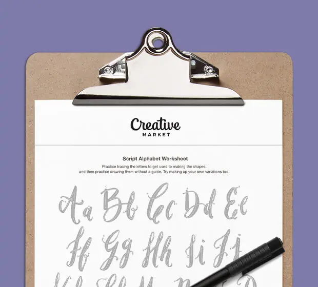
Download these worksheets and start practicing with simple instructions and tracing exercises.
Making beautiful design simple & accessible to all.

Sign up for our newsletter for trend reports, interviews with our favorite creatives, and tutorials on the latest techniques to keep you inspired.

How-To Geek
The best fonts to use in microsoft word for different purposes.

Your changes have been saved
Email is sent
Email has already been sent
You’ve reached your account maximum for followed topics.
Apple Pages vs. Microsoft Word: Which is Better for You?
Should you buy office 2024, this single feature makes new outlook for windows worth it, quick links.
- Calibri: The All-Around Generalist Font
- Consolas: The Champion of Technical Documents
- Helvetica: The Choice for Graphic Designs
- Times New Roman: Classic For a Reason
- Verdana: The King of Clarity
- Fairwater Script: For When You Need to Get Fancy
There are well over a hundred fonts to choose from when using Microsoft Word. While it's fun to experiment with them, it would take forever to try them all out. That's why I'm picking a handful of the best fonts to use with Word across various use cases, be it academia, design, or even coding.
1 Calibri: The All-Around Generalist Font
Calibri is pretty much the poster boy for the Microsoft Office suite these days, even though it's not actually the default font anymore . Think of it like the modern-day Times New Roman: it's the standard everyone is used to now, and thus might not seem very interesting, but there's a good reason anything becomes standard, and that's because it works. This sans-serif font, with its rounded edges and modern aesthetic, is appropriate for just about any content.
That includes academic papers, emails, blog posts, professional documents, and just about anything else. There's no sane person out there that is going to get onto you for using Calibri. It's clean and contemporary but still has a bit of personality to it. At worst, it's unassuming, but that also means that no one is going to be bothered by it. You can use Calibri for just about anything, and though it might not be the best option, it'll certainly be good enough.
2 Consolas: The Champion of Technical Documents
If you need to write up some technical documentation in Microsoft Word, the Consolas font will likely serve you well. This includes coding, technical readouts, data presentation, or any other scenario in which consistent character spacing and no-nonsense legibility are crucial. The monospaced Consolas font fits the bill here.
It might not seem like such a big deal, and to some people, Consolas hardly looks much different from any other generic font. But when you start getting into lines of code or thick paragraphs of complex technical information, every bit of added readability helps, which is why a clearly legible monospaced font like this one is an excellent pick.

3 Helvetica: The Choice for Graphic Designs
Graphic design is often viewed as a fancy creative field, but when it comes to good typography , minimalist simplicity is often the best. Whether it's designing a brochure, a sales email, or a company slogan, simple function goes a long way, and Helvetica is a font that excels in that regard. It blends elegant old-school vibes with the minimalism of modern text, and remains a favorite of many today.
That said, Helvetica is extremely versatile thanks to its impressively neutral legibility. It'll fit right in with corporate branding, but also shine in publications or advertisements. Though it might not be the best choice, it can definitely serve for things like academic papers or recreational writing as well.
4 Times New Roman: Classic For a Reason
Times New Roman is, in some ways, a relic of the past. If you're old enough, you may remember a time when it was considered the default font for Microsoft Word. Those days are behind us, but that doesn't mean Times New Roman is worthless now. It still reigns as the exemplar font for formality, making it a perfect choice for academic, professional, and business writing.
It's more of a tradition, really. There are plenty of other formal fonts out there to use, but Times New Roman has been the standard for that kind of thing for decades. It'll always look right when you're writing a legal document or a research paper. Sometimes, a classic is massively overhyped, but in just as many cases, a classic holds that title for a good reason, and that's definitely the case with Times New Roman.
That said, some sticklers see serif fonts like this one as being outdated or even overly formal. Times New Roman has its time and place to shine, but be aware of how a serif font impacts your visual tone: even in some professional environments, clients, coworkers, and employers may be put off by overly formal visual presentation. Make sure you know your audience and what they expect from your writing!
5 Verdana: The King of Clarity
Digital screens are the primary medium through which we all read these days. They come in all shapes and sizes, and some fonts perform better than others when it comes to legibility on any screen of any size. If people are going to be reading your Microsoft Word documents on any sort of digital screen, Verdana is an excellent choice thanks to its strong lettering and ample spacing.
These features make Verdana an awesome pick if you're writing an e-book or a publication. Even if your writing ends up on something besides Microsoft Word in the long run, writing it in Verdana will give you a good grasp of what it's going to look like on other platforms you may publish on.
6 Fairwater Script: For When You Need to Get Fancy
So far, I've mostly talked about fonts that are easy to read in various situations. Well, legibility isn't everything, at least in some niche cases. People don't often write in cursive anymore, digitally or by hand, but there are a few times when a good script font like Fairwater Script can put in a lot of work as one of the better-looking cursive fonts.
Sending out announcements for a baby shower? Maybe an invitation to an event like a ball or a wedding? Whatever the special occasion is, Fairwater Script can add some celebratory elegance to it. Just remember not to write everything in a cursive script font: it's easy enough to read the big important words, but nobody wants to parse a near-alien written language across several paragraphs.
Ultimately, there are way too many excellent fonts available on Microsoft Word for me to list here. Despite how awesome some of the ones I've talked about are, there are lots of options that can fill their shoes. It's not like Times New Roman is the only formal font, or that nothing can replace Calibri as a standard.
You can even download fonts that aren't already part of Microsoft Word , so experiment with different fonts to find the one you like the most. I'd say there are no bad options, but Wingdings exists, so that'd be a lie. Though even that font could serve as some archaic language for a D&D campaign!
- Microsoft Word
The 24 Most Professional Fonts to Use
Stuart Crawford
Selecting the right font is an important design choice that can enhance—or detract from—the professionalism of a document.
With thousands of fonts to choose from, the possibilities may seem endless. However, not all fonts are well-suited for professional business communications and documents.
This comprehensive guide explores the 24 most professional fonts to create polished, credible business documents that leave a positive impression.
We analyse characteristics like readability, legibility, clarity, formality, visual appeal, and versatility to determine which fonts will top for professional use cases in 2024.
A Serif Sensation: Traditional Serif Fonts Offer Readability & Polish
Serif fonts have long been celebrated for their timeless elegance and functionality. These typefaces are defined by small projecting features at the ends of character strokes, often called “feet and tips.”
This distinct characteristic adds a touch of sophistication and naturally guides the reader's eye along the lines of text, making serif fonts particularly effective for printed materials.
Why Are Serif Fonts Perfect for Print?
Traditionally, serif fonts have been favoured in print media due to their inherent readability. The projecting features help maintain a smooth visual flow, particularly in lengthy texts. As technology advances, the clarity of serif fonts on screens is also improving, closing the gap between print and digital readability.
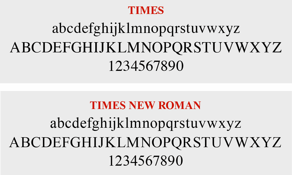
1. Times New Roman
This quintessential serif font designed for the New York Times newspaper in 1931 remains a staple choice to exude professionalism. The fluid serifs and sturdy letterforms allow Times New Roman to be readable in print. The versatile design also displays well digitally. This font suggests that competence and trustworthiness are key to professional communication.
Designed by Matthew Carter in 1993, this serif typeface contains thick, bracketed serifs for enhanced readability. Slightly wider letter proportion compared to Times New Roman improves clarity while maintaining a highly legible 11-point font size. The chunky, semi-bold weight is warm and refined for formal business uses.

3. Bookman Old Style
This classic, versatile serif face echoes Old Style typefaces used in publishing from the mid-1500s into the 1900s. Designed in 1884 by Alexander Lawson for the Century Schoolbook , the slightly condensed letterforms offer a more compact footprint without compressing readability.
The sturdy serifs, graceful curves and horizontal stress suggest Old World heritage, perfect for adding gravitas to professional communications.
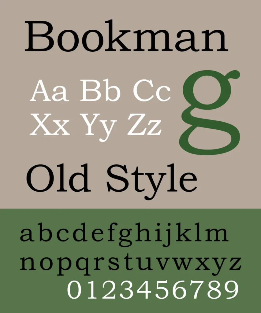
Key Takeaway: Traditional serif fonts like Times New Roman, Georgia and Bookman Old Style offer proven readability and polish that are well-suited for formal business documents.
Distinctive & Dignified: Transitional Serifs Bridge Generations
4. baskerville.
This refined, stately serif face designed by John Baskerville in 1757 defined transitional serif styles, forging a bridge from Old Style to modern looks. The crisp edges offer exceptional clarity, while distinctive ball terminals on letter curves add flair. Baskerville brings heritage elegance to contemporary professional settings, from resumes to reports.

5. New Baskerville
Released in 1917, this refreshed Baskerville interpretation by designer George W. Jones is often preferred for clarity on screens and modern printing presses. The slightly thicker strokes offer a bolder definition without compromising legibility. Pair with Georgia for font contrast that delivers professional polish.
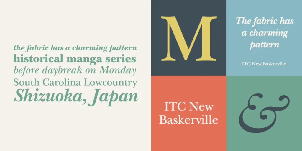
6. Times Ten
Photosetting provider Linotype released this updated take on Times New Roman in 1990 to improve output on low-resolution printers and poor-quality paper stock. Subtle changes like shortened ascenders and descenders optimise modern legibility without forfeiting professional persona. The economical proportions also save space.
In the past, serif fonts were predominantly used in print due to their projecting features, which naturally guide the eye along lines of text. This made them an ideal choice for newspapers and books. However, as screen and resolution technology advances, the distinctions between digital and print legibility are blurring.
Continuous improvements in display quality mean that serif fonts are now becoming equally viable for digital use. This evolution is reshaping the landscape, allowing serif fonts to maintain their classic appeal while adapting to the demands of modern media.

Key Takeaway: Transitional serif typefaces like Baskerville, New Baskerville and Times Ten marry historical richness with sharp digital display for today’s professional contexts.
Modern Serifs Marry Heritage With Contemporary Flair
Created by renowned German typographer Jan Tschichold in 1964, Sabon draws inspiration from classic Garamond designs but optimises for modern requirements. The Roman letterforms offer exceptional clarity and even texture suitable for continuous business reading—an excellent choice to communicate expertise.
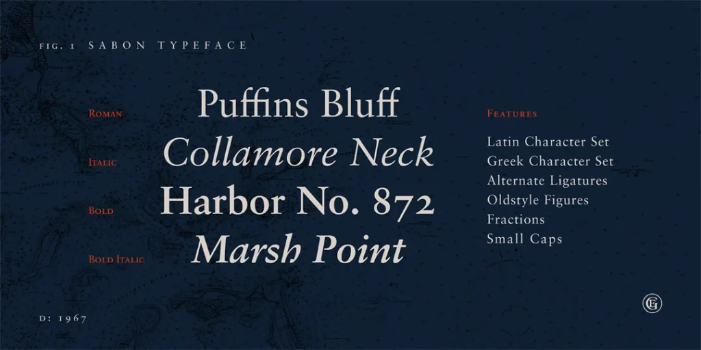
8. ITC Legacy Serif
This 1993 serif release from the International Typeface Corporation retains Times New Roman’s professional personality but exhibits tighter spacing and finer hairlines for improved modern display. The condensed proportions occupy less real estate, allowing more content presentation.
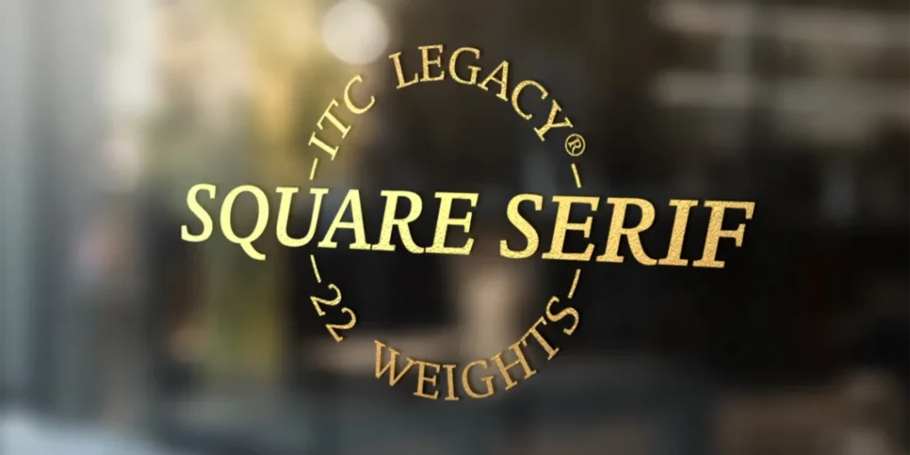
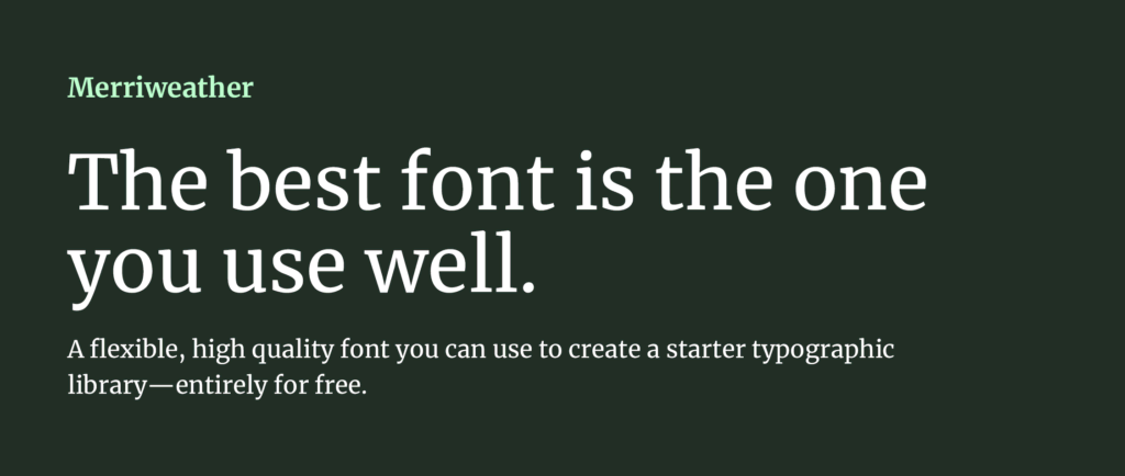
9. Merriweather
Designed by Eben Sorkin in 2010 for Google Web Fonts, this free serif selection exhibits classic proportions and styling adapted for optimal clarity across print, web and digital media. The understated design promotes continuous reading while conveying competence for various professional communications, from handouts to websites.
Key Takeaway: Modern serif font interpretations like Sabon, ITC Legacy Serif and Merriweather smartly evolve heritage styling for today's professional, multi-media business needs.
Sans Serif Fonts Signal Modernity For The Digital Era
Thanks to their clean lines and modern appeal, Sans serif fonts have become the go-to choice for online content. Unlike their serif counterparts, sans serif fonts lack the small lines at the end of character strokes, offering a sleek, uncluttered look that perfectly suits digital screens. This makes them highly legible and versatile, so they dominate the online medium.
What Makes Sans Serif Fonts So Popular?
Sans serif fonts are favoured for their crisp appearance and professional vibe, adding modernity to digital content. They're not just about aesthetics; their design ensures superior screen readability, making them the ideal choice for web design , presentations, and digital documents. When choosing a font, consider your audience and the medium of publication to ensure quality and versatility.
Initially designed by Monotype in 1982 to offer Helvetica -style appeal more economically, this ubiquitous neo-grotesque sans serif font conveys professionalism and modernity. The comfortably spaced proportions ensure approachability while promoting exceptional on-screen readability.
However, like Times New Roman in the serif world, Arial is often considered a safe choice. While it performs its role adequately, it can be seen as lacking uniqueness.
If you aim to differentiate your brand or design, alternative typefaces offering a more distinct look might be worth considering. Arial's widespread use might make your project blend in rather than stand out, so weighing its functionality against the need for distinction is key.

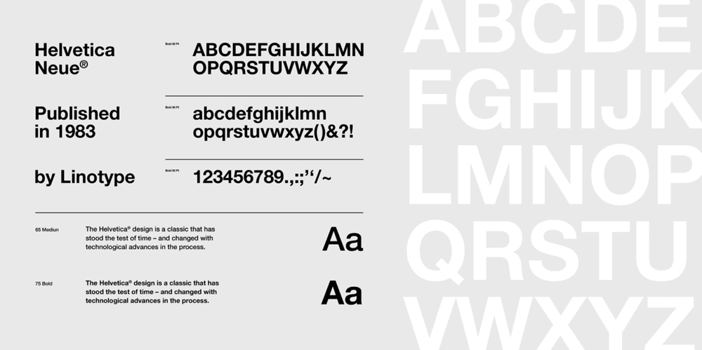
11. Helvetica Neue
This seminal, globally recognised neo-grotesque face originated from the 1957 Helvetica release. Designer Max Meidinger evolved the styling in 1983 to enhance spacing and strokes for improved digital rendering. The Swiss heritage of architectural clarity and purity perseveres through this digitally-optimized typeface.
12. Calibri
As the default font for Microsoft Office programs and Windows since 2007, Calibri offers a humanist sans serif option deeply familiar to modern business professionals. The rounded contours ensure approachability while the reliable rendering remains professionally polished across documents, slides, forms and other uses.

Key Takeaway: Leading neo-grotesque sans serifs like Arial, Helvetica Neue, and Calibri adopt simplified styling that crisply conveys professional digital-age messaging.
Specialised Sans Serifs Target Professional Needs
13. clearviewhwy.
Specifically tailored for road signage by designer Don Meeker in 1998, this humanist sans serif face allows extraordinary readability for content viewed from a moving vehicle. Tested and proven across state transportation departments, Clearview denotes authority for wayfinding signage applications.

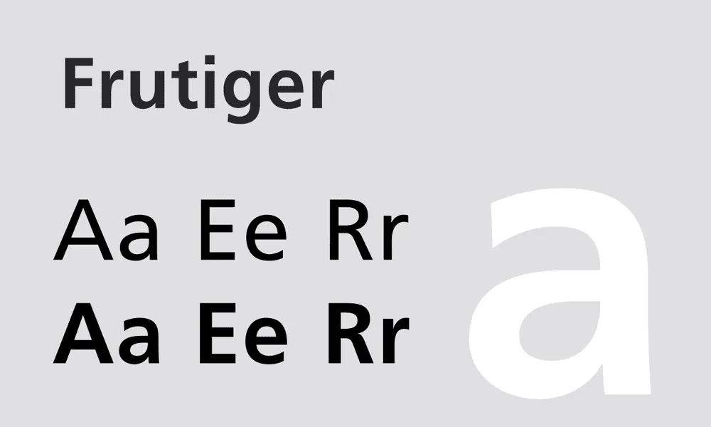
14. Frutiger
This Univers-inspired sans serif, designed by Adrian Frutiger in 1976, improves visual hierarchy through letter variation. Numerals and glyphs are easily distinguished from letters to enhance clarity for signage and labelling purposes. The streamlined Swiss styling also denotes modern efficiency.
15. FF Mark
Designed by Erik Spiekermann in 2009, FF Mark offers a simplified, dotless construction derived from industrial German engineering and architectural signage applications dating to the 19th century. The functional format, stripped of superfluous strokes, delivers clear communication of professional content.

Key Takeaway: Field-specific sans serifs like ClearviewHwy, Frutiger , and FF Mark provide optimised displays targeted for professional signage or technical applications.
Authoritative & Distinctive: Professional Slab Serifs
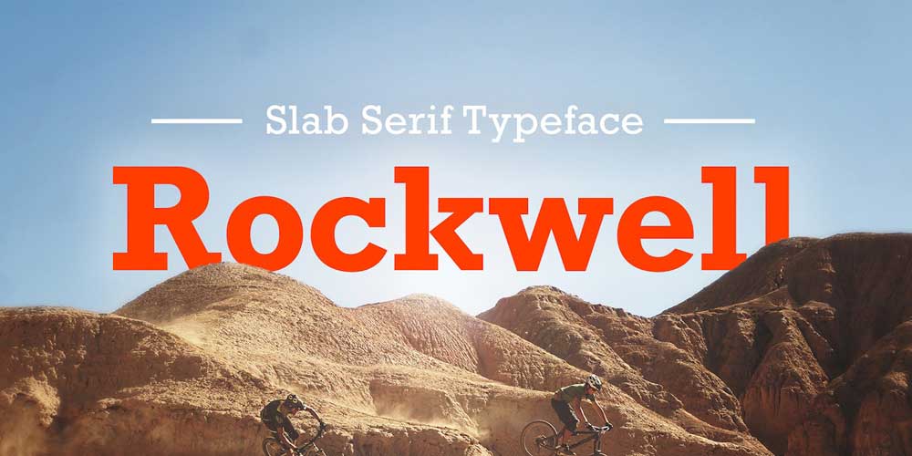
16. rockwell.
Designer Frank Hinman released this bold, sturdy slab serif font in 1934 for the Inland Type Foundry. The thick, monolinear strokes offer substantial visual presence, while softened rectangles lend friendlier allure. Rockwell simultaneously brings commanding gravitas yet approachable warmth to business communications.
HCI editor Matthew Carter designed this efficient slab serif family in 2001 for media conglomerate Martha Stewart Living Omnimedia exclusive use. Structured, compact strokes ensure clarity even at small sizes on inferior printing presses, maximising professional polish for publishing at scale.
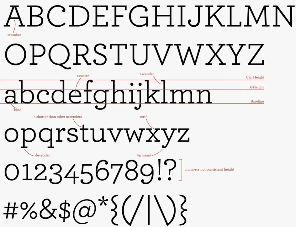
18. Roboto Slab
Christian Robertson expanded his 2013 Roboto humanist sans serif into serif and slab serif families as core Google Fonts selections. Roboto Slab’s modern appearance and responsiveness across digital platforms offer a distinctive professional personality deviating from traditional expressions.

Key Takeaway: Distinctive professional slab serifs like Rockwell, Archer and Roboto Slab couple commanding visual presence with sturdy legibility to elevate business content .
Specialist Display Fonts Grab Professional Attention
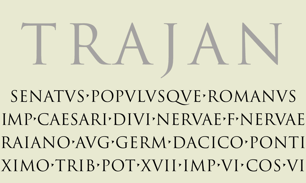
This imposing caps-only Roman square capital's face echoes the solid strokes displayed prominently on Trajan ’s Column monument erected circa 113 AD. The all-caps letterforms project monumentality, allowing this font to emphasise professional titles, logos, signage and headlines with gravitas.
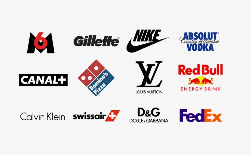
Paul Renner’s 1927 milestone project encapsulated Modernist design with ideological efficiency through ordered, geometric strokes. Branding professionals leverage Futura to communicate focus and innovation, while design principals rely on minimal expression to emphasise information density.
Inspired by architectural signage, designer Tobias Frere-Jones crafted this bold, structural alphabet in 2000 to evoke steadfast New York heritage. Professional designers rely on Gotham’s straightforward style to communicate confidence through headlines, titles, and branding elements .
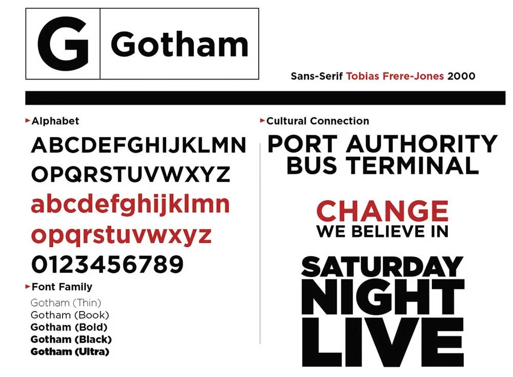
Key Takeaway: Columnar Trajan, modern Futura, and architectural Gotham offer scalable display fonts to attract professional interest to titles, branding and headlines.
Handwritten Fonts Convey Personal and Professional Approachability
22. dearsarah sf pro.
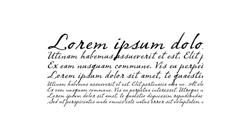
Software developers Balance Type Foundry crafted this stylish, contemporary handwritten face in 2021 to inject personal warmth into professional communications. Ligatures between specific letter pairs boost intimacy while practising restraint to sustain polish, befitting more formal contexts like event invitations or featured callouts.
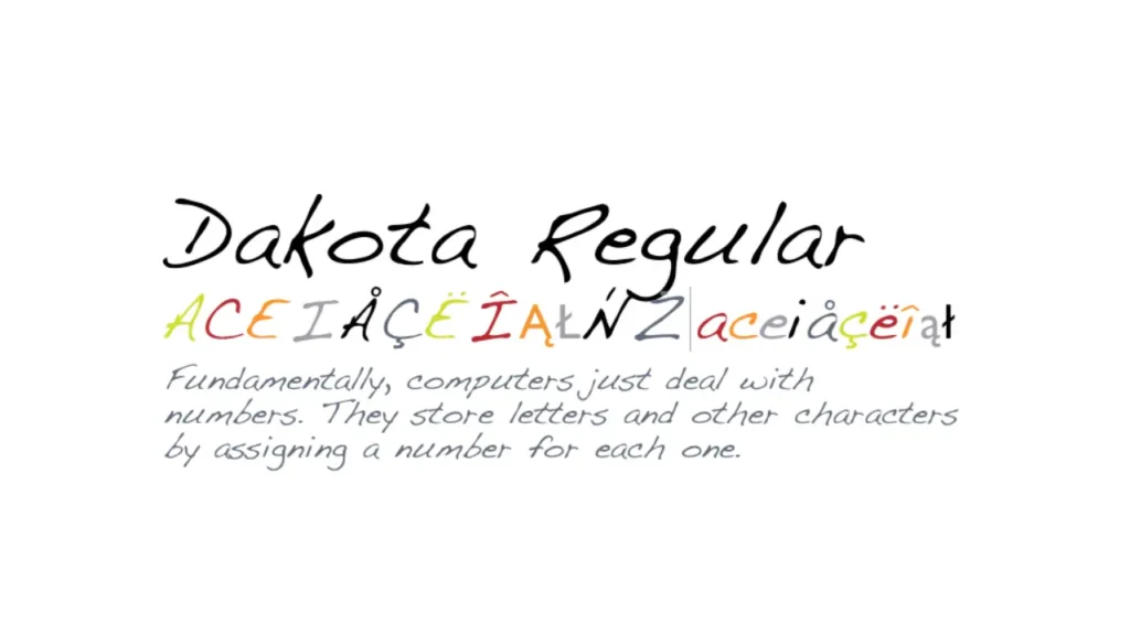
23. Sf Handwriting Dakota
This casual handwritten font comes courtesy of the digital agency Design K to resonate authentically with personal correspondence for professional introductions or outreach touchpoints. Designed with multilingual support, the global accessibility remains professionally inclusive.
24. Homemade Apple
Independent type designer Sam Parrett delivers this distinctive, organic handwritten face that combines whimsical, retro warmth akin to scampering chalkboard renderings with the approachability of a trusted neighbour. Professional applications could include feature headers in reports or emphasis lines within newsletters to boost engagement.

Key Takeaway: Casual handwritten fonts like DearSarah SF Pro, SF Handwriting Dakota, and Homemade Apple humanise professional messaging through personalised execution.
Combining Complementary Fonts Creates Hierarchy & Contrast
Choosing the right typeface for your content is crucial for effective communication. The decision should be guided by the audience you're addressing and the medium of publication. Different sectors have unique requirements:
- Creative Industries : Seek unique and stylish fonts that resonate with innovative designs.
- Legal and Formal Sectors : Opt for clean, clear fonts for lengthy documents to ensure readability.
Additionally, the medium plays a significant role:
- Printed Materials : Some fonts translate better on paper, providing clarity and impact.
- Digital Platforms : Other fonts enhance screen readability, adapting to various devices.
When selecting a font for a document, it's essential to consider several key factors to ensure your communication is effective and visually appealing.
First, consider your audience and the sector you're working in. Creative fields might look for unique and eye-catching styles, while law firms require clean, clear fonts for lengthy documents. Additionally, consider the medium—some fonts are better suited for print, while others excel in digital formats.
Incorporating these broader considerations with practical font combination techniques can elevate your document's impact:
- Align Serif & Sans Serif Faces : Pair a serif such as Garamond or Times New Roman with a sans serif like Arial or Helvetica to create a visual hierarchy through contrast.
- Vary Weights For Emphasis : Use different weights—heavy, light, or condensed—within compatible font families to make key content stand out.
- Highlight Display vs Text : Combine sturdy display fonts like Impact or Gotham to accentuate readable text choices like Georgia or Calibri.
- Maintain Consistent Typography : Limit your professional font combinations to two or three compatible families and ensure consistency across all branded touchpoints.
Ultimately, while there are specific techniques for combining fonts, understanding the context and purpose of your document is just as crucial. By balancing technical font choices with audience and medium considerations, you create documents that look good and communicate effectively.
Key Takeaway : Thoughtfully blending 2-3 complementary fonts into professional communications clarifies visual hierarchy through strategic contrast. While these rules provide a solid framework, always consider the specific needs of your audience and the nature of your publication to make the most effective typeface choices.
5 Key Criteria Define Great Professional Fonts
- Readability – Strong letterforms deliver content consumption efficiently
- Legibility – Distinct characters discern at small sizes
- Clarity – Crisp definition promotes engagement
- Compatibility – Adapts gracefully across media formats
- Personality – Unique traits align with context
Key Takeaway: Professional font technical effectiveness must match appropriate contextual emotion and personality to achieve communications goals fully.
Most Professional Fonts – Recap At A Glance
- Serif – Times New Roman, Sabon, Georgia, Merriweather
- Sans Serif – Arial, Helvetica Neue, ClearviewHwy
- Slab Serif – Archer, Roboto Slab, Rockwell
- Display – Futura, Gotham, Trajan
- Handwritten – DearSarah SF Pro, Homemade Apple
Conclusion: Apply Thoughtful Typography For Professional Results
This expansive guide highlights 24 exceptional font faces spanning common professional categories like Serif, Sans Serif, Slab Serif, Display and Handwritten. Each recommended font qualifies for business usage through optimal legibility, compatibility across modern media, and personality characteristics that strategically match professional communications goals.
While the highlighted selections represent esteemed options, designers must carefully contemplate additional criteria like industry context, audience demographics and branded guidelines when specifying fonts for professional documents or communications.
Traditional selections like Times New Roman remain prudent choices that reliably convey professional expectations for specific formal uses like legal briefs or financial statements. However, this font, often dubbed as the default, has become the go-to typeface for writers wanting to appear professional across various contexts.
Despite its reliability, Times New Roman has become a little overused. Its ubiquity in documents can sometimes lead to a lack of distinctiveness. While it remains a safe choice, consider whether an alternative typeface might better serve your purpose and help your work stand out in a sea of similar-looking documents.
When aiming for professionalism, balance the conventional with the unique to maintain credibility and individuality in your writing. More progressive companies may incorporate distinctive yet legible modern fonts like Helvetica Neue or Roboto Slab to signal forward-thinking, design-focused appeal.
Above all, professional font selections rely on thoughtful implementation that is aligned with the specifics of the intended communication and consumption formats. Suitable fonts effectively capture attention, sharpen hierarchy, strengthen retention and promote clarity to optimise audience engagement. As fine dining plates must be expertly paired to complemental courses, precision font selections elevate messaging while underscoring competence and care through thoughtful typographic presentation.
Review these 24 versatile professional fonts for your next communications project, effortlessly conveying your expertise through strategic typography optimised for business results.
Frequently Asked Questions (FAQ) About Professional Fonts
What are the top 5 most professional fonts.
The five most versatile and professionally appropriate fonts include Times New Roman (Serif), Arial (Sans Serif), Archer (Slab Serif), Futura (Display) and DearSarah SF (Script). Each reliably offers legibility, compatibility and polish for business uses.
What font does Google use?
Product Sans is the primary Google font applied in branding and communications. The custom-designed geometric sans serif offers friendly simplicity aligned with Google's accessible brand personality.
What is the most attractive font?
Beauty proves subjective; attractive fonts vary by audience and context. Classic serifs like Bodoni and Didot offer elegant, fashionable appeal. Friendlier picks like Brush Script and Great Vibes provide emotive warmth. Helvetica Neue and Futura convey sleek modernity.
What fonts do lawyers use?
Legal conventions rely on tradition, so most attorneys use customary fonts like Times New Roman, Arial and Courier New for contracts, rulings and communications upholding document integrity expectations. More progressive firms occasionally incorporate contemporary alternatives like Calibri and Georgia.
What font size is best for professional documents?
Content legibility proves essential for professional communications. Print documents should use at least 11pt font size. Digital presentations can scale down to 8pt font size. Headings should run 2-4pts larger to establish hierarchy. More essential documents may use 12-14pt for optimal clarity.
Related Posts
- Logo Design Rules: 10 Golden Rules for Crafting Logos
- Integrated Office Technology: Streamlining Business Operations
- InDesign vs Illustrator: Which Design Software Should You Use?
- The Vital Role of Graphic Design in Marketing
- How To Design A Corporate Website
- 30 Best WordPress Plugins to Supercharge Your Website
- 50+ Best Gifts for Designers on Every Budget
- Improving the Ecommerce Customer Experience
Love This Post? Share It!
Share on your favourite social media and inspire others.

Need help Building your Brand?
Let’s talk about your logo, branding or web development project today! Get in touch for a free quote.
Leave a Comment Cancel reply
Trusted by businesses worldwide to create impactful and memorable brands.
At Inkbot Design, we understand the importance of brand identity. With our team of experienced designers and marketing professionals, we are dedicated to creating custom solutions that elevate your brand and leave a lasting impression on your target audience.

Microsoft 365 Life Hacks > Presentations > Different Types of Fonts And How to Choose One
Different Types of Fonts And How to Choose One
With so many types of fonts, how do you choose which to use and when ? Knowing how to choose the right font takes some knowledge of the different types of fonts and what they look like. Use our guide to learn more about fonts and how to decide on the best one for what you’re writing .

You’ll first need to understand the basic styles , which include:
We’ll go through each font style to highlight what it looks like, popular fonts in the style, and what they’re good for.

Tell your story with captivating presentations
Powerpoint empowers you to develop well-designed content across all your devices
What does it look like? The identifying feature of serif fonts is the tiny strokes or projections on every end of a letter. Serifs improve readability by making it easy to distinguish the difference between a lowercase L and a capital I. Some of the most used serif fonts include:
- Times New Roman
- Courier New
What’s it good for? Serif fonts have long been considered the most readable fonts. They’re commonly used in print newspapers, magazines, and books, and are recommended to be used in MLA format . Print media prefers serif fonts because it helps guide the eye along a single line of text.
Despite their readability in print, serif fonts can be problematic with digital media. The letters can blur together on low-resolution images and make it difficult to read. While computer monitors and smartphone screens have improved over the years, serif fonts are still not preferred.
What does it look like? Sans-serif fonts are what you’ll see most commonly in your day-to-day life. These fonts are aptly named as they don’t have the serif projections on the letters (sans means without). You’re probably familiar with some of the most common sans-serif fonts, which are:
What’s it good for? Search engines, websites, and social media platforms prefer sans-serif fonts because of their improved readability on a digital screen. Sans-serif fonts are the simplest fonts available and provide clean text that can be used across many platforms.
What does it look like? Script fonts are inspired by handwriting and calligraphy. You’ll notice that most script fonts will look like they’re in cursive, but not every letter will connect or flow the same as if someone had written it in cursive. Letters will include swooping letters and curls, called swashes. Script fonts typically come in one of two styles in casual and formal fonts. Casual scripts are simpler and easier to read, while formal fonts are more embellished. Common script fonts you might see are:
- Harlow Solid Italic
- Brush Script MT
- Fairwater Script
What’s it good for? You’ve likely seen script fonts on wedding or baby announcements, event invitations, and award certificates. Overall, script fonts aren’t considered easy to read (as you can see above) but can look great and enhance your print when used in the appropriate setting.
What does it look like? Monospaced fonts are fonts that utilize letters that take up the same amount of space. For example, the space for capital A and capital I will occupy the same amount of space on a line as one another. Typically, the A and I don’t take up similar space on a line, but a monospaced typeface will format your text in this way. It also conveys a typewriter feel with its consistent spacing. You’ll also see that some serif or sans-serif fonts fit into a monospaced format as well. Examples of some monospaced fonts include:
- Lucida Sans Typewriter
What’s it good for? While monospaced fonts aren’t always the most appealing to a designer, they do have their place. Monospaced fonts make it easy to create a proportional block of text based on the number of characters you want to use. For instance, if you’re making a sign and have space for 20 characters on each line, monospaced fonts make it easy to count characters without trying to compensate for narrow letters like I and a lowercase L.

What does it look like? The fifth font type has many names that include display, decorative, fantasy, and others, but we’ll go with display for the sake of brevity. Display fonts are the diverse fonts of the bunch. This is where you’ll find different styles like thick scripts, stencils, ultra-light, ultra-bold, and others. The diversity of display fonts comes with their function with signage. Similar to monospace fonts, display fonts can come in serif, sans-serif, and script styles. While display fonts aren’t usually used in everyday writing or as a preferred font on a website, you might see these common fonts on logos and banners:
What’s it good for? If you’re not making a sign, logo, or banner, display fonts don’t have much practical use. They can be difficult to read when small and irritating as the novelty wears off after a few lines. Use display fonts when your project or signage calls for it, but we don’t recommend setting one as your default font for your outgoing emails.
What’s best for you? Knowing how to choose a font depends on how you’re going to use it. For those who regularly send emails, write a blog, or do anything else online, a sans-serif font is always going to be the best choice. Choose something that doesn’t fall under the display category because, again, it can be off-putting after a few lines.
A monospace font can look nice and give a vintage feel that comes with a typewriter but isn’t required for the medium. Someone who’s going to type and send a physical letter of any kind should stick with serif fonts because of their readability.
Knowing how to choose a font for what you need is important. Some types of fonts are considered unprofessional or difficult to read in certain situations.Use this guide to help you make the right decision about a font for what you need.
Get started with Microsoft 365
It’s the Office you know, plus the tools to help you work better together, so you can get more done—anytime, anywhere.
Topics in this article
More articles like this one.

4 presentation trends for 2025
Learn which latest presentation trends can make or break your PowerPoint’s message and leave your audience captivated.

How to make your PowerPoint presentations accessible
Check out tips for using PowerPoint accessibility features, so your audience won’t miss any part of your presentation.

How to make your presentations more attractive
Explore tips on how to make your PowerPoint presentation design aesthetically pleasing, no matter the subject.

How to introduce yourself in a presentation
Gain your audience’s attention at the onset of a presentation. Craft an impressionable introduction to establish tone, presentation topic, and more.

Everything you need to achieve more in less time
Get powerful productivity and security apps with Microsoft 365

Explore Other Categories

Best Fonts for Word (And Where You’ve Seen Them Before)
November 9, 2022 Rent My Words Fonts , Microsoft Word , Writing
Believe it or not, Microsoft Word is packed full of stylish and cool fonts and typefaces—you’d just never know it because you’ve only used the program for basic word processing, right?
Well, what if I told you major blockbuster films, big-time musical acts, and designers from different corners of pop culture have used fonts you can easily find in Word for some of their biggest projects?
So, I’m sorry to burst your Calibri-filled bubble, but take a look at all that’s waiting for you under that mile-long font dropdown.
Think—what is the purpose of a font? To help your words stick in the mind of the reader, right? It’s certainly one thing a good font is supposed to do. Well, beyond where Garamond has been used out there in the real world (which we will get to in a second) Garamond is one of the best fonts in Word because it instills confidence in writers.
I’ve heard this from others, and tweets like this confirm—there is something about writing in Garamond that just makes you feel like you’re writing the absolute best text ever.
What’s your writing Hill I will Die On and why is it that Garamond is the best font? — Ally Ally Oxen Free (This Appearing House out now) (@AllyMalinenko) November 4, 2022
Now, in terms of where you might have seen Garamond used before, does this look familiar? As solopress.com notes, the Notting Hill font is in fact Garamond (and remember American Eagle Outfitters ?)
this notting hill poster makes it look like hugh grant is standing beside a window where a 12 ft tall julia roberts peers in pic.twitter.com/lwDK1JZtPr — Lou (@gothhorsegirl) March 3, 2018
“Thick and thin” is a great way to describe Bodoni as mentioned in this helpful tweet.
5. Bodoni Designed by Giambattista Bodoni in the late 1700s, this font – with its extreme contrast between thick and thin strokes – takes us back to a different era of typefaces. Though rather sophisticated, you can tell it wasn’t designed for digital display. pic.twitter.com/71MFycsvvq — The Cultural Tutor (@culturaltutor) October 4, 2022
A fancy and luxuorious font, Bodoni is used in more places than you might have originally noticed, but seeing where in fact it is used will cement the thought of it being an elite and upscale vessel.
I had no idea, but Vogue , Calvin Klein, Elizabeth Arden, and the movie Mamma Mia! all utilize Bodoni.
With a name like Futura, you know we are in for a bit of a modern ride, and straight clean lines confirm—Futura is that font.
First, though, I love this tweet because it mentions Garamond, which is already on this list, and because it is from someone who says they studied typography. So, while I and others might simply think Futura is cool (and love the fact that it is in Word), you have experts out here also giving the font praise.
I like serifed fonts, always have. For books, nothing beats Garamond for legibility and family flow. But my favourite font has always been Futura. Especially when weights are combined. Studied Typography, so my opinion is biased 😉 pic.twitter.com/nZw85WhkfQ — Cheryl Lawson (@CherylLCreative) November 6, 2022
Next, in terms of where you’ve seen it, The Hangover seems to be a popular source. Besides that, though, and what you have to appreciate about fonts, is that simple tweaks allow for words to take on a completely different look, feeling, and meaning.
Read More: Fonts Similar to Futura in Canva
As Solo Press points out , in addition to The Hangover, Futura has been used for The Help , Gravity, and other movies. As you can compare here, The Hangover poster gets its point across in all caps, while The Help opts for mixed case, with both working beautifully. Then you have Gravity which also uses all caps, but utlizes spacing for a, well, more spaced out feel.
Because of this, FUTURA is often used in many sci-fi IPs. For things like Destiny, Gravity & as Interstellar’s secondary type. Neat. pic.twitter.com/7qScJi1bUQ — Liam Wong (@liamwong) March 27, 2017
I went through a lot of this when talking about Star Wars fonts on Canva , but having a good space-age font on standby is always a valuable endeavor. On Word, that font is Eurostile, and it might look familiar if you’re a fan of the show Space Force . Never mind that the show is a parody, Eurostile has a place in all things space-age (as cemented by the tweet below).
The Andersons “helped to cement Eurostile’s reputation as the go-to science fiction typeface.” James Millner takes a look at the futuristic type used in the 60s/70s British TV series UFO, Captain Scarlet, and Thunderbirds. https://t.co/HprjpJbLjP pic.twitter.com/CggBhL0HR8 — Fonts In Use (@FontsInUse) November 16, 2021
Cooper Black
Without beating around the bush, Cooper Black is all over the place. I mean, Vox even has an article titled “Why this font is everywhere” with the subhead of “Cooper Black is pop culture’s favorite font.” That same piece goes on to mention the use of Cooper Black…
“Perhaps you know it from the Garfield comics, Tootsie Roll logo, or the Pet Sounds album cover by the Beach Boys. It’s called Cooper Black, and its popularity and ubiquity have never waned in the 100 years since it was first designed.”
Happy birthday to the Tootsie Roll. Keeping dentists and Cooper Black typophiles happy for more than a century. Celebrate by listening to our episode on display fonts that left an impression. https://t.co/OqHUr7WX5w #tootsieroll #cooperblack #typophile #podcast #popculture pic.twitter.com/rS2TN3Ydfs — TwoDesignersWalkIntoABar (@2deswalkin2abar) February 23, 2022
Just by me mentioning it here you’ll start seeing it more and more.
I don’t even have to write anything about Helvetica. ( Just Creative has labeled Helvetica the “most iconic font overall.”) I mean, if I did want to talk about how many organizations, movies, TV shows, etc. have used Helvetica, we’d be here all day.
So, let’s just focus on this list from Daily Synopsis , and look at how many times some form of Helvetica is mentioned on their list of “Fonts Used in Famous Logos.”
- American Apparel – Helvetica Black
- Caterpillar – Helvetica Inserat Roman
- Fendi – Helvetica Bold
- Jeep – Helvetica Bold
- LG – Helvetica Black
- Lufthansa – Helvetica Bold
- NBA – Helvetica Condensed Black
- Panasonic – Helvetica Black
- Standard Chartered – Helvetica Neue 55 Roman
- Subway – Helvetica Black
- Target – Helvetica Neue Bold
- WhatsApp – Helvetica Neue 75 Bold
- marketing tips
Related Articles

Scroll Trigger Pop-Up: What Is It & How Do You Create One?
It’s unfortunate that a lot of on-page marketing can be thought of as hunting or trapping your website visitor. And honestly, if that is in fact how you’re approaching it, there is a better way. […]

How I used Canva & KDP to illustrate and self-publish a children’s book
Summary: A lot of what I’m seeing already out there on the topic of illustrating a book with Canva seems to focus solely on the book cover, which is great! But, my goal here is to […]

Encouraging Website Visitors to Take Action & Make the Next Step
“But why?” A simple question, but what very well could be a guiding principle for any website. I routinely see website owners who spend hours on a blog post, but don’t bother to consider how […]
© 2021 Last Time Ago LLC

15 Best Fonts for Impactful Presentations in 2024
Shahid shahmiri.

In the world of presentations, every detail counts, and the font you choose is no exception. As we enter 2024, the choice of font has become an integral part of presentation design, profoundly impacting how your message is received and perceived.
Fonts do more than just display text; they set the tone, convey emotion, and can significantly affect audience engagement and information retention. Whether you deliver a corporate report, a creative pitch, or an educational seminar, the right font can elevate your presentation from good to great.
Check out the example of an impactful presentation .
It is key to understand the psychology behind font choices and their impact on audience perception. Different fonts can evoke different feelings – a serif font might convey tradition and reliability, while a sans serif font often represents modernity and simplicity. But with countless fonts available, how do you choose the right one for your presentation?
In this blog, we will explore the “15 Best Fonts for Impactful Presentations in 2024,” covering a range of styles from professional and authoritative serif fonts to sleek and modern sans serifs, and even creative script and decorative options.
With using a Presentation design tool like CustomShow anyone can create amazing presentations using videos, images, and the range of available fonts.
Doesn’t matter whether you’re a seasoned presenter or just starting, CustomShow is easy to use and anyone can create amazing dynamic presentations with it.
The use of a presentation tool and a guide like this blog will help you make informed decisions about font selection, ensuring your presentations are not only visually appealing but also effective in communicating your message.
Let’s dive into the world of typography and discover how the right font can transform your next presentation .
Read more on How to Prepare a Sales-Focused Research Presentation
The Psychology of Fonts:
Understanding the psychological impact of different fonts is crucial in tailoring the mood and message of your sales presentation . Fonts carry their personality and character; for instance, serif fonts like Times New Roman or Garamond are often perceived as traditional and reliable, making them suitable for formal or corporate presentations.
On the other hand, sans serif fonts like Helvetica or Arial exude a more modern and clean vibe, ideal for contemporary and straightforward presentations . Script fonts, while elegant and expressive, can inject a personal touch, suitable for creative or narrative-driven content.
The key lies in aligning the font’s inherent qualities with the tone and purpose of your great presentation , ensuring that the typography complements and enhances your message, rather than distracting from it.
Videos on Presentations Made Easy Schedule A FREE Demo With Us
Top 5 serif fonts for presentations:, a. overview of serif fonts:.
Serif fonts, characterized by small lines or strokes attached to the end of larger strokes in letters, are often associated with professionalism, credibility, and tradition. These fonts are a staple in various presentation contexts, particularly suited for formal, academic, or corporate settings where clarity and authority are paramount.
The presence of serifs makes these fonts exceptionally legible in printed formats and detailed slides, making them a reliable choice for conveying important information with gravitas.
B. Top 5 Serif Fonts for 2024:
Each of these serif fonts brings a unique flavor to presentations, enabling presenters to align their visual style with their content and audience expectations. These top serif fonts of 2024 offer compelling choices for impactful presentations.
Times New Roman
A classic choice, Times New Roman remains a staple in the professional world. Its straightforward, no-nonsense appearance is perfect for financial reports, legal presentations, and academic lectures.
Known for its elegant and timeless look, Garamond is ideal for presentations that require a touch of sophistication without sacrificing readability. It works well for literary topics, historical content, and high-end corporate presentations.
Designed specifically for digital readability, Georgia is a versatile serif font that is equally effective on screen and in print. Its slightly rounded features and ample spacing make it a great choice for webinars and online presentations.
Baskerville
Offering a balance of sharpness and elegance, Baskerville works well for presentations that aim to impress and engage. Its professional demeanor is suited for high-level business presentations, academic conferences, and professional seminars.
Top 5 Sans Serif Fonts for Presentations
A. exploring the appeal of sans serif fonts:.
Sans serif fonts, known for their clean lines and absence of decorative strokes, have become increasingly popular in modern presentations.
Their simplicity and clarity make them ideal for digital screens, where legibility is paramount.
The minimalist design of sans serif fonts lends a contemporary and approachable feel, making them suitable for a wide range of presentation contexts, from tech startups to the top creative agencies .
B. Top 5 Sans Serif Fonts for 2024:
Each of these sans serif fonts offers a clean and modern aesthetic, ideal for a variety of contemporary presentation styles. These top sans serif fonts of 2024 can help enhance your message with style and clarity.
A widely used sans serif font, Arial is known for its versatility and readability. It’s a safe and professional choice for business presentations, especially when dealing with diverse and international audiences.
Renowned for its clean, crisp lines, Helvetica is a favorite for branding and marketing presentations. Its neutral yet appealing character makes it perfect for conveying modern professionalism.
Designed specifically for digital readability, Roboto offers a harmonious balance between mechanical and geometric forms. This font is ideal for tech-focused presentations or any content meant to be consumed on digital platforms.
As a default font in many applications, Calibri is familiar and comfortable for most audiences. Its soft, rounded curves are suitable for both corporate and casual presentations, making it a versatile choice.
Known for its friendly and legible appearance, Open Sans works well in both print and digital formats. It’s particularly effective for educational content, webinars, and instructional presentations, where clarity is crucial.
Top 5 Script and Decorative Fonts for Creative Presentations
A. when and how to use script and decorative fonts effectively:.
Script and decorative fonts are perfect for adding a unique flair and personality to your presentations, especially in creative or less formal contexts. As an SEO consultant , I find these fonts work best for titles, headers, or special emphasis, where their elaborated poster design adds impact without being overwhelming if used sparingly.
The key is to use them sparingly and balance them with more straightforward fonts for body text. They are ideal for presentations in the arts, fashion, entertainment sectors, or digital signage , where visual impact is as crucial as the content itself. Remember, the goal is to enhance your presentation’s aesthetic appeal without sacrificing readability.
B. Showcasing the Top 5 Script and Decorative Fonts for 2024:
These top script and decorative fonts for 2024 can add a distinctive character to your presentations, making them memorable and engaging. While they offer creative freedom, it’s crucial to balance their decorative nature with the functional aspects of your presentation.
Known for its playful and bold style, Lobster is perfect for titles and headings, giving your presentation a touch of modern elegance.
Pacifico offers a relaxed and friendly vibe, ideal for casual or creative presentations where a personal touch is desired.
Great Vibes
This elegant script font adds a sophisticated flair to any presentation, suitable for wedding planners, fashion brands, or upscale events .
Dancing Script
As the name suggests, Dancing Script brings a dynamic and lively feel to your slides, great for engaging and informal presentations.
A bold and contemporary brush script, Brusher is ideal for making a statement in creative and artistic presentations.
Accessibility and Readability
The accessibility and readability of fonts cannot be overstated. Selecting fonts that are easily legible is crucial not only for effective communication but also for inclusivity, ensuring that your content is accessible to all audience members, including those with visual impairments.
A key tip is to opt for fonts with clear, distinct characters, such as Arial or Calibri, and avoid overly stylized fonts that might cause readability issues.
Additionally, consider the size and color contrast of your text against backgrounds; higher contrast and larger font sizes significantly enhance readability.
Prioritizing these aspects in your font selection makes your dynamic presentation more user-friendly, ensuring that your message is conveyed clearly and effectively to every member of your audience.
Font Pairing Strategies
Effective font pairing is an art that can significantly enhance the aesthetic appeal and clarity of your presentation.
A best practice is to combine a serif font with a sans serif font, balancing tradition with modernity. For example, pairing a classic serif like Times New Roman for headings with a clean sans serif like Arial for body text can create a visually appealing and readable layout.
Another strategy is to use two different weights or styles of the same font family, which provides visual variety while maintaining cohesion.
Remember, the key to successful font pairing is contrast and harmony; the fonts should be distinct enough to create interest but similar enough to maintain a unified and professional look.
Read More How to Make Great Presentations That Engage Audiences
Tips for Customizing Fonts
Customizing fonts effectively can help build brand loyalty by elevating the uniqueness and brand alignment of your presentation. To achieve this, consider modifying font styles to match your brand’s personality. Here are the best 5 tips for customizing your fonts:
Align Font with Brand Personality: Choose a font that reflects your brand’s character. For a modern brand, go for a clean sans serif; for a traditional feel, opt for a classic serif.
Experiment with Font Weight and Size: Adjust the weight (bold, regular, light) and size of your font for emphasis and hierarchy within your presentation content.
Use Brand Colors: Customize your font color to match your brand’s palette, enhancing brand recognition and visual appeal.
Create Contrast for Emphasis: Pair contrasting fonts (like a bold headline with a light body text) to draw attention and create visual interest.
Leverage Typography Tools: Utilize tools like Adobe Fonts, Fontsz or Canva for advanced customizations, such as letter spacing, line height, and creating unique font styles .
Common Font Selection Mistakes to Avoid
When selecting fonts for presentations, a common pitfall to avoid is choosing style over legibility. Fonts that are overly decorative or stylized can detract from the clarity of your message, making it difficult for the audience to quickly process information.
Another frequent mistake is using too many different fonts, which can create a disjointed and unprofessional look. Ideally, stick to a maximum of two to three complementary fonts.
Additionally, avoid underestimating the importance of font size; too small fonts can be challenging to read, especially in larger rooms or on smaller screens.
Read More How to Hand Over a Presentation to the Next Person
The choice of font in your presentations can significantly influence the effectiveness of your message. From the psychology behind serif and sans serif fonts to the importance of readability and accessibility, each aspect plays a crucial role in how your content is perceived and received. Take a look at how CustomShow could help in your presentations .
Discover how to elevate your boring presentations
Check out CustomShow sample presentation that keeps your audience in awe. Simply upload your existing PPTx and take your presentation from Static to Stunning.Create your dynamic presentation for free, and sign up on CustomShow .

Meet with our Sales Team
Our sales team can work with you to understand and tailor customshow to work for your business needs..
The 10 best fonts for presentations
Elevate your slidedeck with these fonts, perfect for presentations.

Even if you know your subject, giving a presentation in front of a bunch of strangers can often be nerve-wracking. So it helps to have a series of eye-catching slides to keep you on track and engage your audience. And key to that is picking the best fonts for presentations, which need to tick a number of boxes (you can't just pick any old free font available).
We've found a selection of fonts great for presentations. Most of these are standard system fonts in PowerPoint and many are included in the Windows or Mac operating systems, which means they're licenced for your own personal use. However, if you want to use them as web fonts on a website, or in client work, you will need to license them, so we've included download links too.
What makes a good presentation font?
First, they need to be clear and legible, even at a distance. Secondly, they need to be attractive and eye-catching. Thirdly, they need to convey a polished and appropriate tone for the context of your presentation. And fourthly, they should be widely available, or at least easy to embed, to avoid formatting issues.
In short, whether you're crafting a business pitch, an academic lecture, or a creative showcase, choosing the best font for presentations can make all the difference. In this article, we'll explore 10 great options.
01. Helvetica
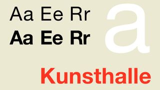
- System font in Powerpoint?: Yes
- Preinstalled on Windows? No
- Preinstalled on macOS: Yes
- Download Helvetica from MyFonts
Helvetica might not be the most exciting choice of fonts. But this classic sans-serif, which is named after the Latin word for ‘Switzerland', is nothing if not reliable. Its clean, neutral and versatile nature means conveys an instant sense of professionalism, without drawing unnecessary attention to itself. And that makes it an excellent choice for presentations of all kinds
There's a reason why Helvetica remains hugely popular, 67 years on from its creation: its letterforms are well balanced are balanced between top and bottom, making them highly legible, even at smaller sizes or when projected. Moreover, its wide range of weights and styles allows for flexibility in creating visual hierarchies within your slides.
So whether you're presenting financial data, marketing strategies, or creative concepts, Helvetica will help you share your words in a way that your audience will find easy to read. And isn't that the most important thing?
In short, if you're looking for a modern, straightforward, and universally appealing typeface for your presentations, Helvetica is a worthy contender.

- System font in Powerpoint?: No
- Preinstalled on macOS: No
- Download Futura from MyFonts
Want to give a bold, dynamic edge to your presentation? Then the geometric sans-serif Futura is a good choice. Its clean lines and perfect circles are based on simple shapes, giving it a distinctive and memorable appearance, and strong visual impact. This makes it an especially good option for headlines and key points you want to emphasise.
At the same time, Futura's clarity and legibility at various sizes will ensure that your message comes across effectively, whether you're presenting on a large projector screen or remotely through your audience's laptops.
In short, when you want to convey themes such as disruption, transformation and a contemporary outlook, in fields such as technology, architecture and design, Futura can help your presentation stand out, while still being very legible and accessible.
03. Garamond
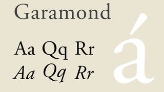
- Download Garamond from MyFonts
Does your presentation call for a touch of elegance and tradition? Then you'll probably want to go for a serif, and Garamond is an excellent option.
With its roots in 16th-century typography, this font will instantly give a sense of sophistication and timelessness to your slides. At the same time, this iconic typeface remains highly legible, especially in its more recent digital adaptations. Its refined serifs and varied stroke weights create a pleasant rhythm that's easy on the eyes, making it work for both headlines and body text.
For these reasons, Garamond will work particularly well for academic talks, presentations on literary topics, or any content that benefits from a more formal tone. In other words, if you want to convey authority and knowledge while maintaining readability, it's a great option.
04. Montserrat
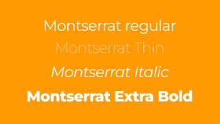
- Download Montserrat from Google Fonts
Is your presentation topic one that's innovative, pioneering, or even game-changing? Then you'll want a font to match, and Montserrat could fit the bill.
Inspired by old posters and signs in Buenos Aires, this eye-catching geometric sans-serif offers a combination of clean, modern letterforms and varied weights. Its crisp edges and open counters contribute to excellent legibility, while its geometric roots give it a contemporary feel. This makes it a great choice for presentations in creative industries, startups, or any other context where a fresh, dynamic tone is required.
Montserrat boasts an extensive family, including various weights and styles, allowing for a creative to typography hierarchies within your slides. So if you want your presentation to feel current and energetic while maintaining clarity and professionalism, it's well worth giving a try.
05. Palatino
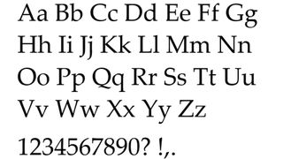
- Download Palatino from MyFonts
If you're aiming for a balance between reassuring tradition and exciting forward-thinking in your presentation, you'll be looking for a font that sits somewhere between traditional and modern design. In which case we recommend Palatino.
This versatile book serif combines the readability of classic Roman typefaces with subtle calligraphic touches. And that makes it well positioned for presentations that require a professional, scholarly tone without appearing overly formal.
Palatino's defined letterforms ensure clarity even at smaller sizes, making it suitable for both headlines and body copy. It works well on screens, and maintains its elegance and readability when projected. And all this makes it a worthy option for presentations in fields like law, academia or the arts.
06. Calibri
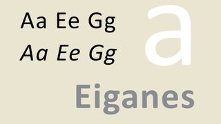
- Preinstalled on Windows? Yes
- Download Calibri from MyFonts
One of the biggest stresses surrounding presentations is the idea that things will go wrong technically, especially if you're using unfamiliar equipment. So if safety is your priority then good news: Calibri isn't just the default font for Microsoft PowerPoint, it's an excellent design choice as well.
This sans-serif has a warm, soft and friendly tone without sacrificing professionalism and legibility, thanks to its slightly rounded edges and open letterforms. It's also a font that adapts easily to different themes and colour schemes. And this means it work well in both corporate and creative presentations.
Perhaps most significantly, Calibri's widespread availability across systems means you're less likely to encounter formatting issues when sharing your presentation. So if you're seeking a safe, versatile and universally compatible font that still looks current, Calibri is the one we'd recommend.
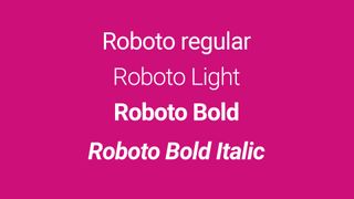
- Download Roboto from Google Fonts
Do you value legibility above all else? Then you can't go wrong with Roboto. Developed by Google, Roboto, this neo-grotesque sans-serif is perfect for designing clear, legible text on screens that need to be readable from a distance, or at small sizes.
Roboto was developed by Google as the system font for Android, and its modern, professional appearance makes it suitable for a wide range of topics and industries. Moreover, its extensive family includes condensed and slab serif versions, which gives you a lot of flexibility in creating visual hierarchies and emphasis within your slides.
In short, Roboto is an excellent choice for presentations that need to look contemporary and function flawlessly.
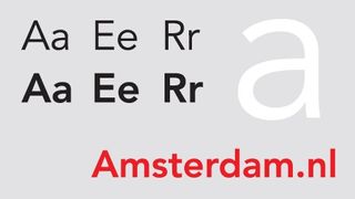
- Download Avenir from MyFonts
If you want to appear warm and friendly, but also cutting-edge, Avenir (meaning "future" in French) is a good font to consider. This geometric sans-serif is similar to Monserrat in that it combines modernist style with humanist touches, and its superb legibility across various sizes makes it versatile for both headlines and body copy.
As such, Avenir would works particularly well for presentations in fields such as technology, healthcare or education. When you want your slides to appear contemporary and polished, yet accessible and inviting, Avenir does a good job of squaring that particular circle.
09. Baskerville
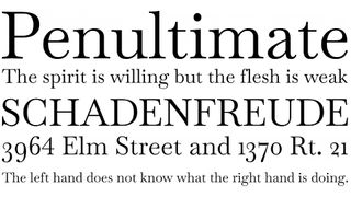
- Download Baskerville from FontSquirrel
Here's another great choice for excluding elegance and authority. Baskerville is a transitional serif typeface with refined forms and high contrast between thick and thin strokes. This all adds up to a dignified, sophisticated appearance, making it a good choice for conveying trustworthiness and expertise.
Baskerville clear, open letterforms ensure good readability on screens, particularly for longer text passages, and this font would works exceptionally well for academic or literary presentations, along with businesses looking to project a sense of heritage and quality.
In other words, if you want your audience to perceive your content as thoughtful, well-researched, and credible, Baskerville can help set the right tone.
10. Georgia
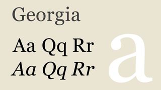
- Download Georgia from MyFonts
Will your talk be viewed remotely? Then try Georgia; a serif designed specifically for on-screen readability, making it great for digital presentations. Its larger x-height and open letterforms ensure clarity even at smaller sizes, covering you if your slides are being viewed on a smaller laptop or tablet.
These letterforms are sturdy enough to render well on various screen resolutions while still providing the traditional, trustworthy feel associated with serif fonts. This makes Georgia when you require a more formal tone while remaining highly legible on a variety of screens. For talks in fields such as journalism, publishing or any other content-heavy topic, it's a good balance between classic style and readability.
Need more fonts for work? See our pick of the best professional fonts .
Thank you for reading 5 articles this month* Join now for unlimited access
Enjoy your first month for just £1 / $1 / €1
*Read 5 free articles per month without a subscription
Join now for unlimited access
Try first month for just £1 / $1 / €1
Get the Creative Bloq Newsletter
Daily design news, reviews, how-tos and more, as picked by the editors.
Tom May is an award-winning journalist and editor specialising in design, photography and technology. Author of the Amazon #1 bestseller Great TED Talks: Creativity , published by Pavilion Books, Tom was previously editor of Professional Photography magazine, associate editor at Creative Bloq, and deputy editor at net magazine. Today, he is a regular contributor to Creative Bloq and its sister sites Digital Camera World , T3.com and Tech Radar . He also writes for Creative Boom and works on content marketing projects.
Related articles

- 2 The Economist's slick illustrations prove that minimalism will always be a winner
- 3 10 must-know digital art trends for 2025
- 4 Midjourney Patchwork wants to be more than just an AI image generator
- 5 Samsung Galaxy Tab S10 Ultra review: AI power in an overpriced form?

COMMENTS
Summary: While exploring the vast Microsoft Word's font library, I've handpicked 25 fonts that are my all-time favorite. My top three choices include: Impact: A bold choice, perfect for making strong, eye-catching headlines and statements.; Goudy Old Style: Offers an elegant, traditional feel, ideal for formal documents.; Century Gothic: Clean and modern, it's great for contemporary designs.
Choose the font that you like from the list below and see when (and if) you should use it. And the best part? Each of these, and 500 more fonts are available for free in Visme's presentation maker.. Browse thousands of presentation templates to get started or tap into the power of Visme's AI presentation maker.. Here's a short selection of 8 easy-to-edit Presentation templates you can edit ...
Over 30 million PowerPoint presentations are made daily. Therefore, when it comes to creating your own slide decks, you need to take every advantage you can get to make it stand out. Among other design choices, choosing the best fonts for presentations can provide a huge impact with minimal effort.
Here are some of the best Powerpoint presentation fonts that you can use to blow away your audience, as you kick-off 2022: How to Choose the Best Font for a Presentation. When choosing the best font for Powerpoint presentations, you have to prioritize readability and legibility to preserve the quality of your content and ensure that your ...
2 Consolas: The Champion of Technical Documents . If you need to write up some technical documentation in Microsoft Word, the Consolas font will likely serve you well. This includes coding, technical readouts, data presentation, or any other scenario in which consistent character spacing and no-nonsense legibility are crucial.
Content legibility proves essential for professional communications. Print documents should use at least 11pt font size. Digital presentations can scale down to 8pt font size. Headings should run 2-4pts larger to establish hierarchy. More essential documents may use 12-14pt for optimal clarity.
For those who regularly send emails, write a blog, or do anything else online, a sans-serif font is always going to be the best choice. Choose something that doesn't fall under the display category because, again, it can be off-putting after a few lines.
Well, beyond where Garamond has been used out there in the real world (which we will get to in a second) Garamond is one of the best fonts in Word because it instills confidence in writers. I've heard this from others, and tweets like this confirm—there is something about writing in Garamond that just makes you feel like you're writing ...
In this blog, we will explore the "15 Best Fonts for Impactful Presentations in 2024," covering a range of styles from professional and authoritative serif fonts to sleek and modern sans serifs, and even creative script and decorative options. ... Top 5 Sans Serif Fonts for Presentations A. Exploring the Appeal of Sans Serif Fonts: Sans ...
And key to that is picking the best fonts for presentations, which need to tick a number of boxes (you can't just pick any old free font available). We've found a selection of fonts great for presentations. Most of these are standard system fonts in PowerPoint and many are included in the Windows or Mac operating systems, which means they're ...